Create Questions With Multiple Choice That Convert
Learn how to write questions with multiple choice that drive lead generation. Master question design, answer psychology, and segmentation to boost conversions.

Multiple-choice questions are the bedrock of interactive lead generation. They're designed to be dead simple for the user, guiding them smoothly towards becoming a lead. By giving people a pre-set list of answers, you slash the mental effort required, making it far more likely they’ll engage and actually finish your quiz. It’s a brilliant way to capture valuable zero-party data without losing momentum.
The Psychology of High-Converting Questions

Before you even think about writing a question, you need to get inside the user's head. Why does this format work so well for lead gen? It’s not just about giving people a few buttons to click. It’s about tapping into basic human psychology to create a frictionless, satisfying journey from casual visitor to qualified lead.
A well-designed quiz makes people feel like they're making progress. Each click feels like a small victory, which triggers what psychologists call the endowed progress effect. This simple feeling of moving forward keeps them hooked and motivated to reach the finish line.
Reducing Decision Fatigue
Let's be honest, we all have it. The biggest superpower of multiple-choice questions is their ability to fight decision fatigue. Instead of hitting your user with an open-ended question that forces them to think, you give them a short, clear list of options. Easy.
This single change makes the user's journey incredibly simple. You get rid of the "what am I supposed to write here?" friction, keeping them engaged and focused. The result? Higher completion rates and cleaner, more useful data, because you’ve guided them towards answers that actually matter for your segmentation.
"The core principle is to make it easier to answer than to leave. Each question should feel effortless, pulling the user forward until they naturally arrive at the lead capture form, feeling understood and accomplished."
Building Momentum and Trust
Think of your quiz less like a form and more like a conversation. Each question answered builds momentum and, more importantly, trust. The user feels seen and heard. You're building a relationship before you ever ask for an email.
This psychological buy-in is everything when it comes to conversions. If you want to dive deeper into the nuts and bolts of how questions measure personality or professional traits, it's worth checking out how psychometric assessments are built. The principles are surprisingly similar.
The Power of Self-Discovery
We love learning about ourselves. The best interactive tools tap directly into this. People answer honestly because they're hungry for a personalised, insightful result.
Your quiz isn't just a quiz; it's a mirror. It answers questions people are already asking themselves:
- Benchmarking: "How do my marketing efforts stack up against my competitors?"
- Diagnosis: "What’s my primary leadership style?"
- Personal Insight: "Am I at risk of burnout?"
Suddenly, you're not just collecting data; you're providing a service. You're giving back a valuable insight that helps someone understand themselves or their business better. A great practical example is an imposter syndrome test, which walks users through self-reflection to deliver a personal diagnosis.
When you align your questions with this deep-seated desire for knowledge, you create a powerful incentive to finish. That’s how you get those insane conversion rates that often sail past 40-55%.
Nailing the Question and Answer Design

The magic of an interactive tool isn't magic at all. It’s careful engineering, built on the back of perfectly designed questions with multiple choice where every single word has a job to do. A killer question always starts with a rock-solid "stem"—the question itself.
From that single, clear stem, you then build out your "key" (the ideal answer for a specific user type) and your "distractors" (the other highly plausible options). Each piece has to be crafted with surgical precision to guide, segment, and qualify your leads without them ever feeling tested or frustrated.
Keep Your Question Stem Laser-Focused
The stem of your question has one job: present a single, unambiguous problem. Any hint of confusion is a conversion killer. People get stuck, they get annoyed, and they bounce.
A good stem is brutally concise and direct. There's zero room for misinterpretation. Avoid those dreaded "double-barrelled" questions that try to ask two things at once. Instead of asking, "What are your biggest marketing and sales challenges?"—which is a total mess—split it. One question for marketing, one for sales.
This clarity does two things. First, the user knows exactly what you're asking and can answer with confidence. Second, the data you get back is clean. It's tied to one specific variable, which makes your segmentation a thousand times more accurate.
The Art of the Ideal Answer and Plausible Distractors
Once the stem is locked in, it's time to build the answer set. This consists of one "key"—the best answer for the specific segment you're targeting—and several "distractors." Distractors aren't just lazy, wrong answers. They are strategic, tempting options that feel plausible to a user who either doesn't know the right answer or, more importantly, fits a different customer profile.
Here is a practical example for a B2B marketing assessment:
- Question Stem: "What's your primary goal for content marketing this quarter?"
Now, watch how the options do the heavy lifting:
- Key (for a high-intent, bottom-of-funnel lead): "Generating sales-qualified leads."
- Distractor 1 (for a top-of-funnel lead): "Increasing brand awareness."
- Distractor 2 (for someone focused on existing customers): "Improving customer engagement."
- Distractor 3 (for a less mature marketing team): "Establishing thought leadership."
See what happened there? Every option maps to a different marketing goal or maturity level. This isn't just a question anymore; it's a powerful, automated segmentation engine. If you want to go even deeper on question mechanics, our full guide on how to make an online quiz is the perfect next step.
The real genius of a great multiple-choice question is in its distractors. They have to be attractive enough to be seriously considered, but different enough to reveal the user's true situation, intent, or knowledge gap.
To really nail this, I put together a quick framework that shows the difference between lazy distractors and ones that actually work for you.
Distractor Design Framework: Flawed vs Effective
| Design Principle | Flawed Example (Don't Do This) | Effective Example (Do This Instead) |
|---|---|---|
| Plausibility | Distractor: "To send more emails." (Too vague and simplistic) | Distractor: "To increase our email newsletter open rates." (Specific, plausible goal) |
| Parallel Structure | Key: "Generating qualified leads." Distractor: "I want to improve my website." (Inconsistent grammar) | Key: "Generating qualified leads." Distractor: "Improving website traffic." (Both start with a gerund) |
| Distinct Concepts | Distractor 1: "Boosting brand reach." Distractor 2: "Increasing brand awareness." (Too similar, causes confusion) | Distractor 1: "Boosting brand awareness." Distractor 2: "Improving customer retention." (Clearly separate goals) |
| Uniform Length | Key: "Driving high-quality MQLs." Distractor: "Website." (Awkwardly short and jarring) | Key: "Driving high-quality MQLs." Distractor: "Growing organic traffic." (Similar length and complexity) |
Getting your distractors right is non-negotiable. It's what separates a tool that just collects emails from a tool that delivers genuinely qualified, segmented leads.
Maintain Parallel Structure for a Seamless Flow
Consistency in your answer choices is huge for user experience. All options in a set must have a parallel structure, meaning they’re grammatically and structurally alike. If one option starts with a verb, they should all start with a verb. If one is a short, punchy phrase, the others should follow suit.
This parallelism makes the choices way easier to scan and compare, which lowers the user's cognitive load. It's a small detail that makes a big difference. Inconsistent formatting feels jarring and unprofessional, breaking the smooth, conversational flow you're trying to create. The principles here are universal; you can see similar logic applied in crafting High-Converting Customer Feedback Forms where clarity is also king.
A user might not consciously notice that you've used parallel structure, but trust me, they'll feel its absence if the options are a chaotic mess of full sentences, random phrases, and single words. It just feels cheap.
This attention to detail pays off big time in engagement and completion rates. For example, in a popular public quiz about world capitals, a high percentage of users correctly identify Paris as the capital of France. That's a direct result of well-structured questions and clear options leading to confident answers.
Using Scoring and Logic to Segment Your Leads
Your multiple-choice questions are doing more than just keeping visitors engaged—they're a quiet, deadly-effective data collection engine. This is where the magic happens. By slapping a score onto each answer, you turn a simple quiz into a powerhouse for segmenting leads. You stop collecting random contacts and start understanding who they are, what keeps them up at night, and how ready they are to buy.
Consider this: if you’re a SaaS company selling project management software, a user picking answers about “scaling challenges” and “enterprise integrations” is in a completely different universe than someone clicking on “getting started” and “managing small teams.” Scoring is how you measure that distance, automatically.
Assigning Values to Answers
The simplest method is a basic point system. For each question, you just assign a value to the answers that indicate a strong fit for your solution.
But a far better way to play this game is with weighted scoring. This is where you give more points to answers that signal serious commercial intent. Because let’s be honest, not all questions are created equal, and this model gets that.
For instance, a question about company size is nice to know. A question about budget? That’s mission-critical. An answer indicating a budget over $50,000 should carry way more weight than an answer showing a team of 10-50 people. This simple tweak ensures your final score is a true reflection of lead quality.
Mapping Scores to Segments
Once you've got your scoring dialed in, the next move is to map those score ranges to actual lead segments or buyer personas. This is how you turn raw numbers into something your marketing and sales teams can actually use.
A practical mapping example might look like this:
- 0-25 Points (Low Intent / Nurture): These folks are probably just kicking the tyres. Tag them for a top-of-funnel email sequence that drips out educational content like blog posts and whitepapers. Keep it light.
- 26-50 Points (Medium Intent / MQL): This group is getting warm. They clearly get their problem and show interest. Route them into a Marketing Qualified Lead (MQL) workflow that offers up case studies or webinar invites.
- 51+ Points (High Intent / SQL): Ding ding ding! These are your hottest leads. Their answers show a burning need and a perfect fit. Tag them as Sales Qualified Leads (SQLs) and get them to your sales team, pronto.
By setting these thresholds, you’ve just built an automated qualification machine. Your sales team can stop wasting cycles on lukewarm leads and focus all their energy where it counts—on prospects who actually want to talk business.
This is the core of any solid lead qualification engine. If you want to see how these exact principles work inside a major CRM, check out our deep-dive guide on lead scoring in HubSpot. We walk through setting up these kinds of rules step-by-step.
Building Profiles with Category-Based Scoring
Want to get even more sophisticated? Use category-based scoring. Instead of tallying up one overall score, you assign points to different categories based on a user's answers. It's the perfect method for building incredibly detailed user profiles.
Imagine a financial advisory firm running a "What's Your Investment Style?" quiz. The answers could feed points into several different buckets:
- Risk Tolerance: (Conservative, Moderate, Aggressive)
- Time Horizon: (Short-Term, Mid-Term, Long-Term)
- Investment Goals: (Capital Growth, Income Generation, Wealth Preservation)
A user might finish and land with a profile like: Aggressive Risk Tolerance, Long-Term Horizon, Capital Growth Focus. This kind of rich data is gold. It lets you create hyper-personalised follow-ups, like an email campaign specifically about growth stocks for long-term investors.
This approach works because it mirrors how people actually think about their own needs. A well-known quiz on JetPunk, for example, asks users to identify the number of federal states in Germany. The fact that a whopping 67% of people get it right shows how multiple-choice can effectively gauge knowledge. In a B2B context, you can use the same principle to segment users by expertise—sending advanced prospects to your high-level content and beginners to the 101 guides. You can find the detailed quiz stats on JetPunk here.
When you get this right, scoring and logic transform your interactive tool from a neat gimmick into a core strategic asset. You’re not just building a list of names; you’re building a segmented, qualified, and prioritised pipeline that's ready for action.
100% Free Lead Magnet Audit
Our AI analyzes your website and delivers custom growth strategies in seconds.
Personalizing the User Journey with Branching Logic
Scoring is great for qualifying leads, but if you want to create an experience that feels less like a form and more like a real conversation, you need to get good at branching logic. This is where you move beyond a simple, one-size-fits-all path and start customising the journey in real-time, based on how people answer.
It’s the secret sauce that makes an interactive tool feel genuinely adaptive. Instead of every user seeing the same set of questions with multiple choice, branching logic carves out unique pathways for different people. Each question feels like a natural follow-up to the last, making the user feel like you actually get them.
You're not just collecting data points; you're building a relationship, one relevant question at a time.
Mapping Out Different User Paths
The whole game with branching logic is mapping. Before you even think about building, you have to visualise the different journeys a user could take. Think of it like a "choose your own adventure" book—each choice opens up a new, relevant chapter.
Let's say a B2B SaaS company has a marketing automation tool. They could use branching logic right from the get-go:
- Question: "What's your current team size?"
- Path A (Answer: "1-10 employees"): This user is probably a startup or a small business. The logic immediately routes them to questions about startup-specific pain points, like "What's your biggest obstacle to growth?" with options like "Limited budget," "Lack of brand awareness," or "Wearing too many hats."
- Path B (Answer: "500+ employees"): Bingo, an enterprise lead. The conversation instantly pivots to their needs, asking things like, "Which of these systems do you need to integrate with?" and listing options like Salesforce, Marketo, or custom APIs.
That one simple fork in the road completely transforms the experience. The startup founder feels seen, and the enterprise manager knows you understand their complex tech stack. Both walk away feeling like they had a valuable interaction.
The decision tree below shows how this works in practice. User answers don't just add to a score; they actively steer the user towards a specific segment.
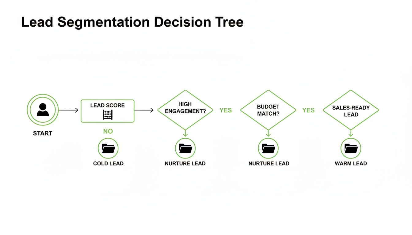
This shows that every click is a signal, guiding the user down a path you’ve already mapped out for them.
Keeping Your Logic Powerful Yet Manageable
It’s tempting to get carried away and build a branching structure that looks like a spiderweb. Trust me, I've seen it happen. While it might seem powerful, overly complex logic quickly becomes a nightmare to build, test, and fix.
The key is to be strategic.
Start small. Identify the one or two most critical segmentation questions in your quiz. These are the questions that create the most meaningful split in your audience—think company size, primary goal, or job role. Build your first branches from those key decision points.
The goal isn't to create a unique path for every single user. It's to create distinct paths for your most valuable segments. Focus on the forks in the road that have the biggest impact on qualification and sales conversations.
For instance, you might have one main branch for high-intent leads and another for those just browsing. Within that high-intent branch, you could add another layer to separate decision-makers from influencers. This keeps your logic sharp and effective without getting you tangled in complexity.
If you're unsure where the biggest improvement opportunities are in your lead magnet strategy, a free lead magnet audit tool like Magnethive can give you a head start. It generates a comprehensive report with AI-powered ideas for new lead magnets, analyzes your existing one, and shows the potential ROI impact, often highlighting the exact spots where branching logic would make the biggest difference.
When you nail this kind of intelligent routing, you’re doing more than just improving the UX. You're handing your sales team hyper-segmented leads, complete with a clear story of the choices they made and what they actually need.
Making the User Experience So Good, They Can't Help But Finish

You can have the most brilliant logic and perfectly written questions with multiple choice, but if the user experience feels clunky, confusing, or just plain slow, you’re dead in the water.
Getting this final polish right is what separates a lead magnet that gets ignored from one that users are genuinely excited to complete. It's all about obsessively removing friction at every single touchpoint.
A seamless experience isn't a "nice-to-have" — it directly drives your completion and conversion rates. Every detail, from the copy on your buttons to the layout on a tiny mobile screen, sends a signal to the user about how much you value their time.
Get it right, and you build trust that carries all the way through to the sale.
Writing UX Copy That Actually Motivates
Every single word in your interactive tool is part of the experience. This is not the place for corporate jargon or clever marketing speak. Clarity is everything. Your goal is to make each step feel effortless and obvious.
Think about the microcopy—those tiny bits of text that guide the user:
- Question Prompts: Instead of a robotic "Question 3 of 10," try something more human, like, "Great, just a few more to go!" or "Now let's look at your team's setup." This small change reframes a boring quiz into a collaborative journey.
- Button Text: Ditch "Submit." Seriously. Swap it for something that communicates value, like "See My Results" or "Get My Personalised Plan." The button should promise a reward for their effort.
- Error Messages: If a user skips a required question, avoid a harsh "This field is required." A much softer, "Please choose an option to continue," works wonders.
This kind of thoughtful copywriting reduces user anxiety and keeps the momentum going. It feels less like a test and more like a helpful conversation.
Designing for Engagement and Trust
A clean, professional design is non-negotiable. It instantly signals credibility and makes the whole process feel more engaging. Your design should actively help the user, not distract them.
I've found that focusing on these three visual elements pays off big time:
- Progress Bars: This is a huge psychological lever. Showing people how far they've come and how close they are to the finish line drastically reduces abandonment rates. It’s a simple visual cue that says, "You're almost there, don't give up!"
- Clean Layouts: Use tons of white space. A cluttered interface is overwhelming and makes it harder to focus on the question. I almost always recommend sticking to one question per screen. It keeps the user locked in on the task at hand.
- Mobile-First Design: A massive chunk of your users will be on their phones. Your tool must look and work flawlessly on a small screen. That means big, easy-to-tap buttons and text that you can read without squinting.
A great user experience is invisible. The user shouldn't notice the design; they should only feel the smooth, effortless flow from one question to the next. The moment they have to stop and think about how to use the tool, you've already lost them.
Don't Forget Accessibility (Most People Do)
This is an often-overlooked but critical piece of the puzzle. Designing your tool to be usable by people with disabilities isn't just the right thing to do—it widens your audience and signals that your brand is inclusive and professional.
You don't need to be an expert to get the basics right:
- Colour Contrast: Make sure there's enough contrast between your text and background colours. People with visual impairments need to be able to read everything easily. There are free online tools to check this.
- Keyboard Navigation: Can someone complete the entire quiz using only their keyboard? All your buttons and options should be navigable and selectable without ever touching a mouse.
- Clear Labels: Use descriptive labels for all fields and buttons. This is essential for people who use screen readers to browse the web.
Building an accessible tool from the start is way easier than trying to fix it later. It ensures everyone, regardless of ability, can get the value you're offering.
Burning Questions, Answered
You've got the basics down, but a few nagging questions always pop up when you're in the weeds building these things. Let's tackle the most common ones I hear.
How Many Choices Should I Give People?
For most lead-gen tools, the magic number is somewhere between three and five options.
It's a delicate balance. Go with less than three, and you risk making the "right" answer for a specific segment way too obvious. But pile on more than five, and you'll trigger decision fatigue. People get overwhelmed, their eyes glaze over, and they just click away.
Four options is usually the sweet spot. It gives you room for one perfect answer (your "key") and three well-crafted, believable distractors. That's enough to get sharp, meaningful data for your segmentation without making the whole thing feel like a chore.
Bottom line: Every single answer option needs to pull its weight. If it doesn't serve a clear purpose in your scoring or segmentation, it's just noise. Cut it.
What About "All of the Above" or "None of the Above"?
Just don't. In the world of lead generation, you should almost always avoid these.
I get the temptation—they feel like a safe catch-all. But in reality, they're a crutch for a poorly designed question, and they kill the quality of your data.
Think about it. Someone clicking "All of the above" tells you nothing about their biggest pain point or their most urgent need. You're trying to capture precise, segmentable intel, and these generic options do the exact opposite.
If you find yourself wanting to add one, it's a huge red flag that the question itself needs a rethink. Try making it more specific. Or, if multiple points truly are relevant, switch to a multiple-select format with checkboxes. That way, the user can pick several options and you still get granular data.
How Do I Know if My Questions Are Actually Working?
You test. Relentlessly. You can't just build it, launch it, and hope for the best.
Start by A/B testing different ways of phrasing a question or its answers. See what drives higher completion rates. It's often the small tweaks that make the biggest difference.
Next, become a detective and dig into your analytics. Find the drop-off points. If a huge chunk of users are bailing on the same question, you've found your problem child. That question is either confusing, irrelevant, or just plain boring.
Your data is the ultimate source of truth. Are your leads ending up in the right buckets? Are the personalised results you're showing them actually hitting the mark? If the outcome doesn't match the input, the problem is almost always in the questions.
But don't forget the human element. Grab a few people from your target audience and just watch them go through it. See where they pause. Ask them what they're thinking. This qualitative feedback, paired with your hard data, will show you exactly what to fix to get the results you're after.