The High-Converting Multi Step Form Playbook
Discover how to design, build, and optimize a multi step form that captures more qualified leads. Learn UX patterns, tech stacks, and CRO secrets.
A multi-step form simply breaks a long, intimidating form into smaller, bite-sized pieces. Instead of overwhelming someone with a wall of questions all at once, you guide them through a series of simple steps.
This one change can radically boost your lead generation. It makes the entire process feel easier and less like a chore, which means more people will actually start and finish it. It turns an interrogation into a conversation.
Why Multi-Step Forms Capture More Leads

We've all been there. You land on a page, ready to download a guide or get a quote, and you’re hit with a massive form asking for your life story. It’s an instant "nope." That initial friction is enough to kill a conversion before it even has a chance.
Multi-step forms are the perfect antidote. By breaking the process into smaller chunks, you slash the perceived effort. Instead of seeing a dozen fields, the user just sees two or three. That feels manageable. That feels easy.
The Psychology of Momentum
This approach isn't just about looks; it's rooted in a powerful psychological trigger called the foot-in-the-door technique. The concept is simple: people are far more likely to agree to a big request after they’ve already said yes to a small one.
A multi-step form uses this to its advantage by starting with easy, low-stakes questions.
- Step 1: "What's your biggest business challenge?" (Low commitment, easy to answer)
- Step 2: "How big is your team?" (Slightly more specific, still easy)
- Step 3: "What's your name and email?" (Higher commitment, but now they're invested)
Every completed step is a micro-commitment. It creates a sense of progress, and users become psychologically invested in finishing what they started. This momentum carries them through to the final step, making them much more likely to hand over their contact info—the very thing they might have balked at if you'd asked for it upfront.
A multi-step form isn't just a design choice; it's applied behavioural science. By sequencing questions from low to high friction, you create a psychological runway that guides users smoothly toward conversion. The final 'ask' feels like a natural conclusion, not a hurdle.
Building a Conversational Flow
Beyond the psychology, multi-step forms just create a better user experience. They feel like a natural conversation. A single, long form feels like an interrogation, but a stepped approach feels like a helpful dialogue where each question logically follows the last.
This conversational style builds trust and keeps people engaged. For instance, a mortgage broker could use this to qualify leads:
- First Step: "Are you looking to buy a new home or refinance?"
- Next Step (if "Buy"): Asks about their desired property value and deposit amount.
- Final Step: Asks for contact details to send personalised mortgage options.
The flow feels helpful and tailored, not demanding. The result? A higher submission rate, for sure, but also much higher-quality data. Engaged users give more accurate and thoughtful answers.
Single Step vs Multi Step Form Performance
The data doesn't lie. Moving from a single, long form to a multi-step process consistently lifts conversion rates, often dramatically. Here’s a quick breakdown of what we typically see:
| Metric | Single Step Form | Multi Step Form |
|---|---|---|
| First Impression | Overwhelming, high friction. | Approachable, low friction. |
| Cognitive Load | High. Users must process all fields at once. | Low. Users focus on 1-2 questions at a time. |
| User Psychology | Feels transactional and demanding. | Taps into commitment & consistency principles. |
| User Drop-off | High initial drop-off rate. | Low initial drop-off; users are eased in. |
| Typical Conversion Rate | Low (~2-3%). | High (~5-8% or more). |
| Lead Quality | Variable; users may rush or provide bad data. | Higher; engaged users provide more accurate info. |
Ultimately, the numbers prove that breaking down the process is a winning strategy for anyone serious about lead generation.
The performance lift isn't just theoretical. Studies have shown significant uplifts when moving to a multi-step flow. If you want to dive deeper, you can explore more conversion rate optimisation statistics, but the takeaway is clear: stop scaring your leads away with giant forms.
Designing a Seamless Form Experience
A great multi-step form doesn't feel like a chore. It feels like a guided conversation. The secret isn't just chopping questions into steps; it's about crafting every single element to feel intuitive, reassuring, and frankly, effortless.
Success comes down to a smart mix of visual cues, a logical flow, and crystal-clear communication. From the moment someone starts, they need to feel in control and know exactly what’s coming. This is where simple design choices can have a massive impact on your form's completion rate, turning potential drop-offs into qualified leads.
Guiding Users with a Progress Bar
One of the most powerful tools you have is the humble progress bar. This simple visual element immediately answers two subconscious questions every user has: "How long is this going to take?" and "How far along am I?" By managing their expectations from the get-go, you kill the anxiety that makes people bail.
A well-designed progress bar acts as a psychological anchor, showing users the light at the end of the tunnel. It reinforces their sense of accomplishment with each completed step, giving them a little dopamine hit that motivates them to keep going.
With data privacy regulations being a global concern, users are warier than ever about what data they're handing over. A transparent progress indicator helps build trust by showing the full scope of the process upfront. User testing has shown that adding a clear progress bar can boost completion rates simply because people feel better oriented and less suspicious about what data is being requested next. You can find more insights on how progress bars improve form conversions on vendorharbour.com.
The Art of Question Sequencing
The order you ask questions in is critical. Your goal is to create a path of least resistance, building momentum from the very first click. A cardinal rule here is to always start with the easiest, lowest-commitment questions.
Think about it like a real-world conversation. You wouldn't walk up to a stranger and immediately ask for their phone number. The same logic applies to your form.
- Start Easy: Kick things off with broad, non-threatening questions about the user's goals or challenges. For a marketing agency, a good opener is, "What's your primary marketing goal?" not "What's your annual marketing budget?"
- Build Up: Gradually move towards more specific or personal information. Ask about their company size or industry before you even think about asking for contact details.
- Save the "Ask" for Last: The request for an email address or phone number should almost always be in the final step. By this point, the user has already invested their time and effort, making them far more likely to see it through to the end.
This "easy-to-hard" structure taps into the psychological principle of commitment and consistency. It makes the final submission feel like a natural conclusion, not a painful hurdle.
Choosing the Right Form Fields
The type of field you use for each question directly impacts how easy it is to answer. Choosing the right input can make providing information faster, easier, and even more engaging. Just throwing a bunch of text boxes at your user is a recipe for abandonment.
Let's look at some common scenarios:
- Buttons or Image Choices: Perfect for simple, mutually exclusive options. Instead of a clunky dropdown for "What is your role?", use visually appealing buttons for "Marketer," "Founder," and "Sales." It's much faster to process and tap on a mobile device.
- Sliders: When you need a number within a range (like a budget or team size), a slider is way more interactive and less intimidating than a blank text field. It gives context and makes the selection feel less absolute.
- Checkboxes: The go-to when users can select multiple options, like "Which services are you interested in?"
- Text Fields: Use these sparingly. Reserve them only for information that is truly unique, like a name, company, or email address.
By replacing generic text fields with interactive elements like buttons and sliders, you reduce the cognitive load required to complete the form. Each tap feels like progress, transforming the process from data entry into a guided, interactive experience.
The design of your fields should also feel at home on your page. Ensuring your form complements your landing page is crucial for maintaining a cohesive and trustworthy brand experience. You can read our guide on designing a best practice landing page to learn more about creating that seamless journey.
Using Conditional Logic to Personalise the Journey
A static form is lazy. It asks everyone the same questions, completely ignoring who they are or what they actually need. It's a massive missed opportunity. The real magic of a modern multi-step form is its ability to adapt on the fly, creating a unique, relevant path for every single user. This is where conditional logic comes in.
Conditional logic, or branching, is just a fancy term for a simple "if this, then that" setup. It lets your form show, hide, or skip questions based on how someone answered the previous ones. Instead of a rigid, one-size-fits-all questionnaire, you create a dynamic journey that feels more like a real conversation.
Crafting Dynamic Form Paths
The whole point is to cut out the fluff. Why ask a B2B lead about their company size if they've already told you they're a freelancer? Why ask what software they use if they just said they're only starting their search? Every pointless question you ask adds friction and pushes them closer to abandoning your form.
Conditional logic fixes this by creating different paths for different people.
- For a service-based business: A question like, "What service are you interested in?" could offer options for 'Web Design', 'SEO', and 'PPC'. Pick one, and the form instantly tailors the next questions to that specific service. No more asking SEO leads about their branding colours.
- For a SaaS company: If a user selects "I'm a beginner" when asked about their experience, the form can smartly skip all the advanced feature questions and jump straight to booking a basic demo.
- For a real estate agent: The first question has to be "Are you looking to buy or sell?" The follow-up questions about property type, budget, and timeline will be completely different depending on their answer.
This isn't just about making the form shorter; it's about showing the user you respect their time. The form feels intelligent and built just for them, which builds a ton of trust and keeps them moving forward. This simple flowchart shows how even a tiny bit of logic can improve the experience.
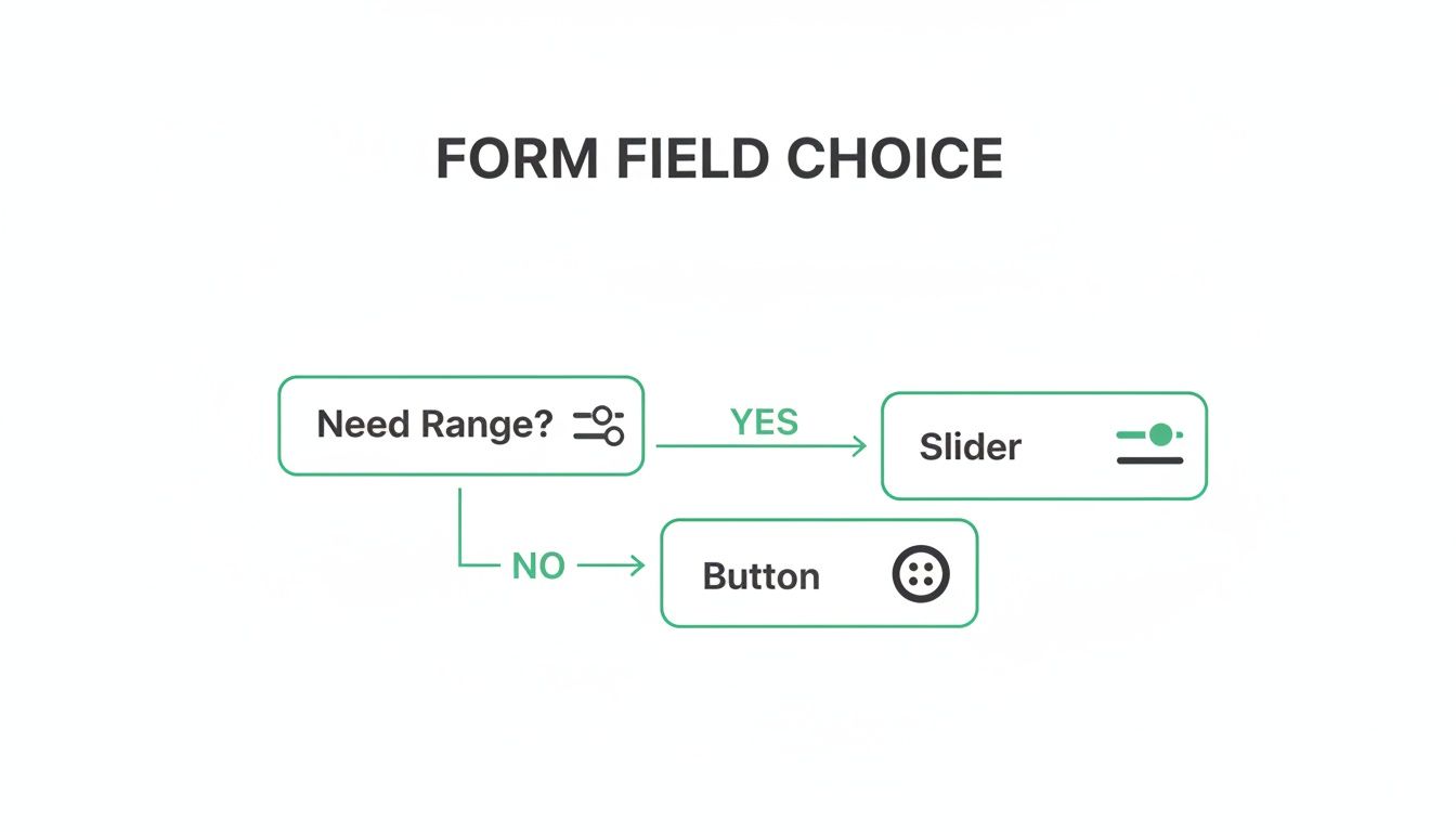
This illustrates a micro-decision: choosing an interactive slider for a budget range instead of a generic text box. It's a small touch, but it makes the user's journey feel more guided and less like filling out a tax return.
Implementing Real-Time Lead Scoring
Beyond personalising the path, conditional logic turns your form into an automated lead qualification machine. You can do this with real-time lead scoring—a system where you assign points to specific answers to measure a lead's quality while they're still filling out the form.
This is how you separate the hot prospects from the tyre-kickers, instantly. You just need to decide which answers signal a great fit—like a certain company size, budget, or pain point—and assign points to them.
A lead scoring system built into your multi-step form acts as an intelligent filter. It ensures your sales team spends their time on prospects who are ready to buy, dramatically improving efficiency and shortening the sales cycle.
Let's say you're a B2B software company. Your ideal customer has a team of over 50 people and a significant budget. Your scoring might look something like this:
| Question | Answer | Points Awarded |
|---|---|---|
| What is your role? | C-Level/Director | +20 |
| Manager | +10 | |
| Other | +0 | |
| How large is your team? | 50+ Employees | +30 |
| 10-49 Employees | +10 | |
| <10 Employees | +0 | |
| What is your budget? | > $10,000 | +40 |
| 10,000 | +15 | |
| < $5,000 | +0 |
Automating Lead Routing
Once your scoring is set up, you can use it to automatically decide what happens after someone hits "submit." This is where you connect the form's brain to your actual sales and marketing operations.
- High-Value Leads (score > 60): These are your red-hot prospects. Route them straight to a senior sales rep's calendar to book a demo. Send a personalised follow-up email from a key account manager. Flag them as high-priority in your CRM. The works.
- Mid-Value Leads (score 30-60): These folks have potential but might need a little more convincing. Add them to a specific email nurture sequence or invite them to a relevant webinar.
- Low-Value Leads (score < 30): This might be a student, a competitor, or just not the right fit. Send them a link to your blog or add them to a general monthly newsletter. You keep them warm without wasting sales resources.
This kind of automated segmentation is a game-changer. Your best leads get an immediate, high-touch response, and your sales team’s pipeline stays clean and focused. By building this logic directly into your form, you start qualifying leads from the very first click. A great form is the foundation of a strong lead magnet strategy. If you're unsure how your current assets are performing, a tool like Magnethive's free lead magnet audit can generate a report with new ideas and ROI analysis to strengthen your entire funnel.
100% Free Lead Magnet Audit
Our AI analyzes your website and delivers custom growth strategies in seconds.
Choosing the Right Tech Stack for Your Form
Alright, you've mapped out the logic and designed the user flow. Now for the fun part: actually building the thing. This is a critical fork in the road, where you have to balance speed, budget, and how much control you really need.
The path you take will come down to your team's skills, your wallet, and your desire for customisation. There's no single "best" way to build a form; the right choice is the one that fits how your team operates. If you want to go deeper on the technical foundations, it's worth understanding how to choose a tech stack for your SaaS product to make sure whatever you build is solid.
Let’s break down the main options.
No-Code and Low-Code Form Builders
For most marketing teams, this is the path of least resistance. Dedicated form builders are your fastest route from idea to a live form, letting you build and launch something sophisticated in a few hours, not weeks. And you won't write a single line of code.
Tools like Tally, Typeform, and Jotform are brilliant at this. They specialise in creating slick, conversational forms with all the bells and whistles—like conditional logic and progress bars—baked right in.
The trade-off? You give up some control. You’re usually stuck with the platform’s design limitations, and the costs can creep up as you need more advanced features or get more submissions. But for teams that need to ship fast, they're a no-brainer. If you're looking for something more powerful than the basics, check out our breakdown of the best Google Form alternatives.
A Look at Custom Development
When you need total control over every pixel, animation, and data point, building it yourself is the only way to go. This means your development team will code the form from the ground up using HTML, CSS, and JavaScript, probably with a framework like React or Vue.js to make it feel snappy.
This route offers unlimited flexibility. You can perfectly match your brand, create unique interactions, and integrate with any obscure internal system or API you can dream of.
Custom development turns your multi-step form from a third-party widget into a core, branded asset. It gives you full ownership over the data and user experience but requires a significant investment in development time and ongoing maintenance.
Honestly, a simple version isn't as scary to build as it sounds. The core of it is just HTML for the form fields, a bit of CSS to show and hide the different steps, and some JavaScript to manage the "next" button logic.
Here's a simplified snippet to show you what I mean:
<!-- Step 1 -->
<div id="step-1" class="form-step active">
  <label for="name">Name:</label>
  <input type="text" id="name" />
  <button onclick="nextStep(2)">Next</button>
</div>

<!-- Step 2 -->
<div id="step-2" class="form-step">
  <label for="email">Email:</label>
  <input type="email" id="email" />
  <button onclick="nextStep(3)">Next</button>
</div>
.form-step {
  display: none; /* Hide all steps by default */
}
.form-step.active {
  display: block; /* Show only the active step */
}
It takes technical skill, for sure, but the payoff is a form that's perfectly tailored to your brand and your exact operational needs.
To make the choice clearer, here’s a quick comparison of the different approaches.
Tech Stack Comparison for Multi Step Forms
| Approach | Best For | Pros | Cons |
|---|---|---|---|
| No-Code Builders | Marketing teams, rapid prototyping, campaigns with tight deadlines. | - Incredibly fast to build & launch - No coding skills needed - Handles backend & data storage | - Limited design customisation - Can get expensive at scale - Data is on a third-party platform |
| Low-Code Platforms | Teams with some technical skill needing more control than no-code. | - More customisation options - Can integrate with more systems - Faster than full custom dev | - A steeper learning curve - Can still be restrictive - Often subscription-based costs |
| Custom Development | Companies needing full brand control, complex integrations, or unique UX. | - 100% customisable - Full ownership of code & data - Can be optimised for performance | - Requires developer resources - Slower to build & iterate - You're responsible for maintenance |
Ultimately, the right choice depends on where you place the most value: on speed and simplicity, or on control and customisation.
Connecting Your Form to Your Marketing Ecosystem
A form that just sits there collecting dust is a wasted opportunity. The final, crucial step is making sure the data you collect actually goes somewhere useful. Your form, no matter how it’s built, must talk to the rest of your marketing and sales stack.
This is usually handled with direct integrations or webhooks.
- Your CRM is Priority #1. Connect your form to HubSpot, Salesforce, or whatever CRM you use. This is non-negotiable. Every new lead should instantly become a contact, get assigned to the right person, and have all their answers logged. No more manual data entry.
- Feed Your Email Platform. At the same time, push that new contact into your email marketing tool, like Mailchimp or ConvertKit. This lets you immediately trigger a welcome email or drop them into a nurturing sequence based on how they answered your questions.
- Track Everything in Analytics. Finally, make sure form submissions fire events in your analytics tools like Google Analytics 4. This is how you measure your form's conversion rate and see which marketing channels are actually driving qualified leads.
How to Analyze and Optimize Form Performance

Hitting "publish" on your multi-step form isn't the finish line. It's the starting gun.
The real wins don't come from just launching a form; they come from treating it like a living, breathing asset. It needs constant attention, monitoring, and tweaking. A data-driven approach is the only way to turn a pretty good form into a lead-gen machine.
You can't improve what you don't measure. That means setting up solid tracking before you get your first submission. We need to go way beyond just counting leads and start dissecting the entire user journey, click by click.
Identifying Your Core Form Metrics
To really understand what's going on, you need to zero in on a few key performance indicators. Think of these metrics as your form's vital signs. They’ll tell you exactly where users are getting frustrated and where your biggest opportunities are hiding.
Get obsessed with these three numbers:
- Start Rate (or Engagement Rate): This is the percentage of people who actually start filling out the form after seeing it. If this number is low, it’s a huge red flag. It could mean your first question is too aggressive, confusing, or just plain boring.
- Completion Rate: The big one. This is the percentage of users who start the form and make it all the way to the final "submit" button. It’s your top-level scorecard for the form's overall health.
- Step Drop-off Rate: This is where the gold is buried. This metric shows you the percentage of users who bail at each specific step. Finding a step with a high drop-off rate is like finding a map to buried treasure—it tells you exactly where your form is broken.
Imagine you see a massive 50% drop-off on Step 3, right where you ask for a phone number. Boom. You've found the culprit. That single question is creating too much friction, giving you an immediate, actionable insight to test against.
Setting Up Your Analytics Framework
So, how do you track all this? While a standard Google Analytics 4 setup is great for tracking final submissions, you need more firepower to see the step-by-step picture.
This is where specialised tools are a game-changer. Tools like Hotjar or Zuko are built specifically for this. They automatically track every single interaction, generating visual funnels that pinpoint exactly where people are giving up. That level of detail is non-negotiable for a proper optimisation cycle.
For a broader perspective on this, it's worth exploring proven strategies to improve overall website conversion rates.
Running Impactful A/B Tests
Once your tracking is live and you've spotted a weak link, it's time to experiment. A/B testing is your best friend here. The key is to change only one thing at a time. I know it’s tempting to overhaul the whole step, but if you change five things at once, you’ll never know which change actually moved the needle.
A high-performing multi step form is the result of continuous, data-backed iteration. Each A/B test is an experiment that gets you closer to a frictionless user experience, turning small wins into significant gains in lead volume and quality.
Start by testing the elements most likely to have a big impact, based on your data:
- Question Wording: Could you ask the same question in a simpler, less intimidating way? "What is your annual recurring revenue?" feels pretty corporate. How about trying "What is your company's approximate annual revenue?"
- Button Copy: Don't just stick with "Next Step." Test a benefit-driven call-to-action like "Get My Free Quote" and see how it performs.
- Number of Steps: If you have a long form, maybe two simple steps could be combined. Or, if one step feels overwhelming with too many fields, try splitting it into two.
This constant cycle of analysing data, forming a hypothesis, and running a test is the absolute core of conversion rate optimisation marketing. And it works. Global analyses show that a well-optimised multi-step form can boost conversions by up to 300% compared to a clunky, traditional one. As you can read in this deep dive on multi-step form performance, this approach can slash your lead acquisition costs.
Burning Questions About Multi-Step Forms
Alright, so you're ready to build your multi-step form, but a few questions are probably rattling around in your head. That’s normal. Let's tackle the big ones head-on so you can move forward with confidence.
How Many Steps Is Too Many?
Look, there's no single magic number here. But from what I've seen, the sweet spot is usually between three to five steps.
The goal isn't just to break the form up; it's to group related questions into logical chunks. Each step should feel like a small, self-contained task. Get one thing done, then move to the next.
Imagine a marketing agency's form:
- Step 1: "Tell us about your project goals." (Easy, gets them thinking about the outcome.)
- Step 2: "A bit about your company." (Context gathering.)
- Step 3: "Where can we reach you?" (The final, high-commitment ask.)
This flow feels natural. It doesn't throw a wall of 15 fields at someone all at once. The only real way to know for sure what works for your audience is to A/B test different step counts. Start with three and see how it performs.
Will a Multi-Step Form Tank My SEO?
Short answer: Nope.
Search engine crawlers don't interact with your form's dynamic JavaScript states. They read the static content on the page—your headlines, your copy, your metadata. A well-built form is invisible to them in that sense.
But here's the catch: a poorly coded form absolutely can hurt you. If it's slow to load or riddled with JavaScript errors, it can drag down your page speed and Core Web Vitals. And since Google uses those as ranking factors, a clunky form can indirectly harm your SEO.
So, the lesson is simple: prioritise clean code and performance. Make sure your form helps your user experience, not hinders it.
What's the Best Way to Handle Form Validation?
This one's easy: real-time, inline validation. It's not even a debate anymore.
This means you check the user's input as they type, field by field. They get instant feedback before they even think about clicking "next."
Give them clear, friendly error messages right next to the field that's causing trouble. Something like, "Oops! Please enter a valid email address." This is a million times better than letting them fill out the whole form, hit submit, and then get hit with a list of red error messages.
That old-school method of validating everything at the end is a massive cause of form abandonment. It's frustrating and feels like you've failed a test.
Instant feedback reduces that friction and keeps people moving forward. It’s a small detail that makes a huge difference in completion rates.