Best Practice Landing Page Guide to Boost Conversions
Discover the best practice landing page framework. Learn how to combine design, compelling copy, and interactive content to skyrocket your conversions.
A best practice landing page? It’s a web page stripped down to its bare essentials, with one clear conversion goal in mind. It’s ruthlessly focused. That means no site navigation, no competing offers, nothing to distract a visitor from doing the one thing you want them to do—like downloading a resource, signing up for a trial, or hitting "buy."
Its success hangs on just three things: clarity, relevance, and a completely frictionless user experience.
Why Most Landing Pages Fail to Convert
I’ve seen this story play out a thousand times. You’ve poured a ton of money and effort into driving traffic to your site. You’ve got a killer offer, a solid product, and a team ready to jump on every new lead. But the needle on your conversion rates just isn't moving. The silence is deafening. You’re left scratching your head, wondering what on earth went wrong.
The problem usually isn’t your traffic or even the offer itself. It’s the landing page. Most are built like digital brochures—they just talk at the visitor. They throw up a wall of text, list a few features, and slap a generic "Submit" button at the bottom, hoping for the best.
This one-sided conversation doesn't just feel ancient; it actively shoves potential customers out the door. It makes the lazy assumption that every visitor is the same, wants the same thing, and is ready for the exact same pitch. The reality? Your audience is searching for an experience that feels personal and gives them immediate value, not another piece of marketing collateral to read.
The Shift from Monologue to Dialogue
The fundamental flaw is treating your landing page as a monologue when it needs to be a dialogue. Think about it this way:
- Static Pages: Present information and then demand personal data in return. This creates a high-friction, low-trust exchange right from the start.
- Interactive Pages: Pull the visitor in by asking questions, giving them personalised results, or helping them solve a tiny piece of their problem on the spot. This builds trust before you ever ask for an email address.
For a practical example, instead of offering a dry PDF on "How to Improve Your Marketing ROI," an interactive ROI calculator delivers that same value instantly and personally. The visitor plugs in their own numbers and sees a real, tangible outcome. They’re no longer a passive reader but an active participant.
That simple shift turns a hard sell into a helpful consultation.
The core issue is that we've been trained to gate content, not to create value-first experiences. A PDF download is a transaction; an interactive tool is a relationship-starter.
This guide is here to flip that old script. We’re going to dismantle the static page model piece by piece and rebuild it around genuine, human engagement. This is about creating a journey that guides visitors from initial curiosity to confident conversion—not by shouting at them, but by making them feel heard, understood, and empowered.
The Anatomy of a High-Converting Landing Page
Before we dive into the clever stuff, let's get the fundamentals right. A great landing page isn’t a mishmash of cool-looking elements. It's an engineered experience where every single piece—from the headline down to the button colour—is obsessed with a single goal: getting that conversion.
Think of it like building with LEGOs. Sure, you can randomly stick bricks together, but the masterpieces follow a plan. Each piece has a job. Your landing page is exactly the same. The whole point is to grab a visitor's attention, earn their trust in seconds, and make the next step feel obvious and easy.
When you get these core parts humming in harmony, the numbers don't lie. Landing pages consistently outperform regular website pages. Why? Because they're ruthlessly focused. No distracting navigation, no mixed messages—just a clear path to value.
The Essential Building Blocks
Every landing page that actually converts is built on the same foundational components. If you skimp on even one of them, the whole structure gets wobbly, leaving visitors confused and your leads going elsewhere.
Let's break down the must-haves:
- The Headline: This is your first impression. Your only impression, sometimes. It has to scream the main benefit of your offer and connect directly with the visitor's problem.
- The Hero Image/Video: A picture is worth a thousand words, but on a landing page, it's worth a thousand conversions. Your hero shot needs to back up the headline, showing the product in action or hinting at the awesome outcome the user will get.
- Benefit-Focused Copy: Nobody cares about your features. Seriously. They only care about what those features do for them. Your copy needs to be punchy, scannable (think bullet points), and all about making the visitor's life better.
- Social Proof: This is your credibility engine. Testimonials, logos of companies you've worked with, impressive stats from case studies, or simple customer reviews. It’s the fastest way to quiet that little voice of doubt in a visitor's head.
- The Call-to-Action (CTA): This is the main event. Your CTA needs to be a big, bold button that stands out. The text should be action-packed and specific, like "Get Your Free Audit," not a boring "Submit."
The infographic below nails what happens when these pieces don't work together, which is usually the root cause of a failing page.
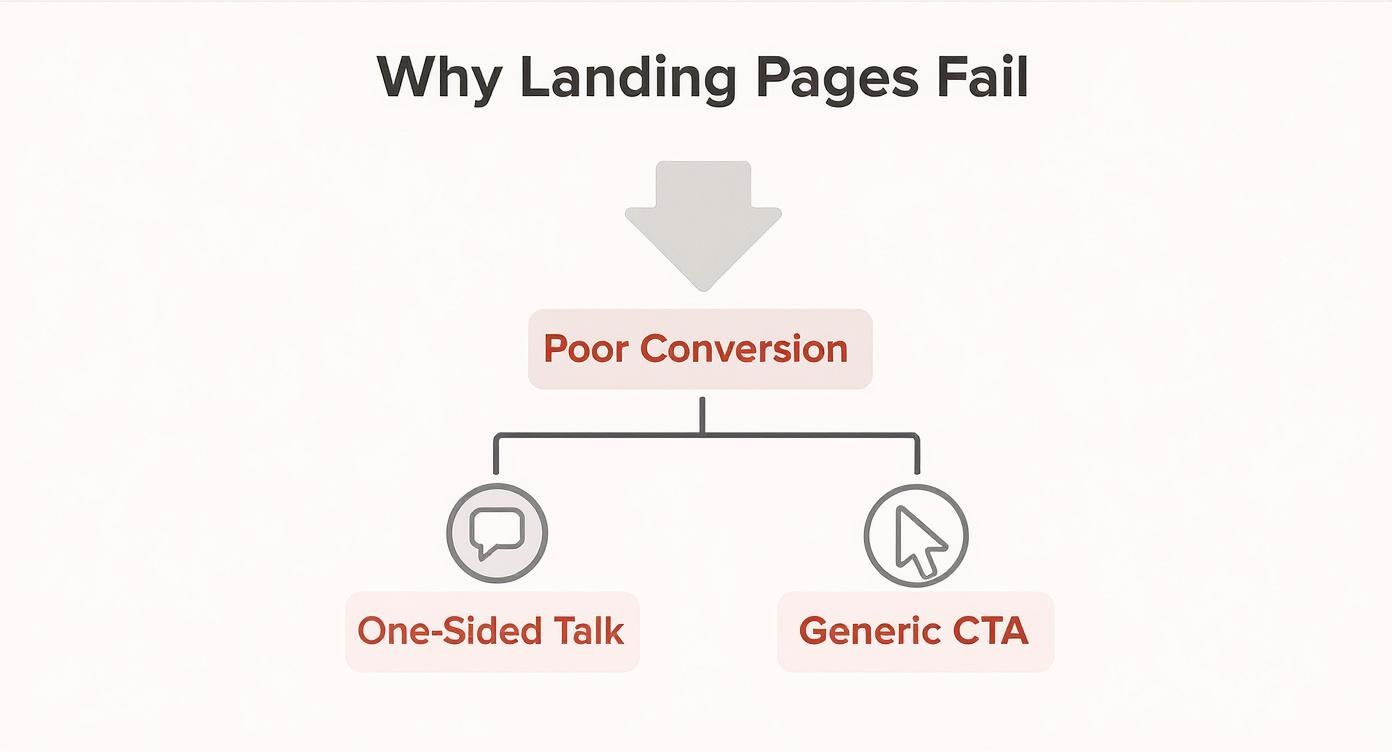
As you can see, poor conversions often boil down to a one-sided conversation and a weak, uninspired CTA that fails to create any urgency.
To help you keep these elements straight, here's a simple table outlining their roles.
Core Components of a High-Performing Landing Page
| Component | Purpose | Key Best Practice |
|---|---|---|
| Headline | Grab attention and communicate the core value proposition instantly. | Make it benefit-driven and ensure it matches the ad copy. |
| Hero Visual | Provide immediate context and evoke an emotional response. | Show the product in use or the end result of using it. |
| Copy | Persuade the visitor by explaining the "what's in it for me?" | Use bullet points and focus on outcomes, not features. |
| Social Proof | Build trust and reduce friction by showing others have succeeded. | Use real testimonials with names and faces for authenticity. |
| Call-to-Action (CTA) | Guide the user to the single desired action. | Use strong, action-oriented text and a contrasting button colour. |
Nailing these components is the foundation for a page that does its job effectively.
Putting the Pieces Together
Getting these general principles down is non-negotiable for any campaign. But remember, one size doesn't fit all. Different goals demand different approaches. For example, if you're targeting customers in a specific area, you'll need to tailor your strategy. You can learn more about that by exploring resources on building winning location landing pages.
The most common mistake I see is a disconnect between the ad and the landing page. If someone clicks an ad promising a "free marketing template," the headline on the page better say something almost identical. Message matching isn't a suggestion; it's a requirement for building trust from the very first second.
Moving Beyond Static Lead Magnets
The era of the PDF download is over.
For years, the playbook was simple: offer a free ebook or whitepaper for an email. But how many of those PDFs are actually read? And how many are just gathering digital dust in a downloads folder?
Your audience is drowning in static content. They don't want more homework or another dense document to sift through. They want immediate answers, personalised insights, and experiences that actually engage them.
They want value, and they want it now.
The problem isn't that people don't want your expertise; it's that they don't want to work so hard to get it. A static PDF is a one-way street—it talks at them. An interactive tool, on the other hand, starts a conversation.
The Power of Instant Gratification
Here’s a controversial take: most lead magnets fail because they create a value deficit. The user gives you their precious contact info upfront but only gets the promised value later... if they even bother to open the file.
It's a transaction built on hope. And that's a shaky foundation for building trust.
Interactive content flips this entire model on its head. Instead of promising value, it delivers it instantly.
The core difference is this: a static lead magnet is a monologue where you present information. An interactive tool is a dialogue where you help the user discover that information for themselves in a personalised way.
Let's make this real. Consider these alternatives:
- Instead of an ebook on "Saving for Retirement," offer a simple retirement calculator. The user inputs their age and savings, and boom—they see a projection in seconds. That's tangible, personal value.
- Instead of a whitepaper on "Choosing the Right Software," build a short diagnostic quiz. The user answers a few questions about their needs and gets a tailored recommendation. They feel understood, not just marketed to.
These tools provide the instant gratification a downloadable file never could. They turn passive visitors into active participants, which is the first step toward building a real relationship.
Why Interactive Tools Attract Better Leads
The real magic here isn't just about higher engagement—it's about lead quality.
When someone takes the time to use your calculator or complete an assessment, they're sending a massive signal of intent. They aren't just a casual browser kicking tyres. They are someone with a specific problem they are trying to solve right now.
Now think about the data you get. With a PDF, you get an email address. With a quiz, you get an email plus a rich profile of their challenges, goals, and needs—what we call zero-party data. This is gold, willingly handed over by the user.
This lets you segment and nurture leads with scary precision. You're no longer guessing what they care about; they’ve told you directly. This is a game-changer for sales teams, who can walk into conversations armed with context and insight. Exploring different types of online quiz makers can open up new ways to capture this valuable data.
Simple tools, often built with no-code platforms, can generate a steady stream of traffic and highly qualified leads. How? By solving one small but significant piece of your customer's problem. It's not about building complex software; it's about providing immediate, tangible value that a static PDF just can't match.
Boosting Engagement with Interactive Elements
Moving from a static page to an interactive one is the single biggest lever you can pull to improve your landing page. It’s the difference between giving a lecture and starting a conversation.
A static page just talks at people. But an interactive element? It pulls them in, asks them questions, and gives them something valuable and personal, right then and there. It's the ultimate way to show, not just tell.
This isn't about adding flashy animations for the sake of it. It's about changing the entire value exchange. Instead of demanding an email for a PDF they'll probably never read, you offer a tool that solves a tiny piece of their problem immediately. That's how you build real trust before you ever ask for a thing.
100% Free Lead Magnet Audit
Our AI analyzes your website and delivers custom growth strategies in seconds.
From Passive Consumption to Active Participation
The real problem with a static lead magnet is that it forces your visitor to be a passive consumer. They download a guide and are left to dig through it, hoping to find the bits that apply to them. An interactive tool flips that script entirely, making them an active participant in finding their own solution.
This active participation gives you so much more than just a lead; it gives you genuine intent and incredibly valuable data.
Think about it. Someone who spends three minutes plugging numbers into your ROI calculator is showing a much higher level of interest than someone who just blindly downloads an ebook. They're actively trying to figure out how your solution fits into their world.
Here’s the controversial take: clinging to static PDFs is just bad marketing. You are consciously choosing a method that delivers lower engagement, lower conversions, and lower-quality leads simply because it feels familiar. The data is clear—interactive content isn't a fad; it's a fundamental shift in what users expect. People want answers, not homework.
Real-World Examples of Interactive Lead Magnets
Theory is one thing, but seeing these tools in the wild is what really makes it click. And we're not talking about complex software projects here. Often, they are simple, focused tools that deliver a massive punch of value.
Here are a few practical examples you could steal for your own pages:
- ROI Calculators: B2B companies like HubSpot master this. They use calculators to help prospects see the potential financial upside of their software. A visitor can pop in their own metrics—like current traffic and conversion rates—and instantly get a projection. This turns a vague promise like "get more leads" into a hard, tangible business case.
- Diagnostic Quizzes: A company selling skincare could build a quiz like "What's Your Skin's True Type?" The user answers a few questions about their routine and goals, and in return, gets a personalised product recommendation. It's worlds more engaging than a generic "Guide to Skincare" PDF.
- Assessment Tools: For any service business, an assessment is a goldmine. A marketing agency, for example, could offer a "Website Grader" tool. The user just enters their URL, and the tool spits back a score with actionable tips. It perfectly demonstrates expertise while uncovering a need the agency can solve.
If your current lead magnet is falling flat, odds are it's because it's static. A great first step is to see what an interactive replacement might look like. You could use a free lead magnet audit tool like Magnethive which generates a comprehensive report with 3 AI-powered lead magnet ideas, analysis of your current lead magnet, and shows ROI impact.
Why Simple Tools Drive Traffic and Leads
You don't need a team of developers to get this done. Plenty of no-code platforms let you build calculators, quizzes, and assessments in just a few hours. The key isn't the tech; it's about solving one specific, high-value problem for your ideal customer.
A well-designed interactive tool becomes more than a lead magnet; it becomes a utility. People will seek it out, share it with colleagues, and return to it, generating organic traffic and high-quality leads long after your initial promotion ends.
This simple shift turns your landing page from a temporary campaign asset into a long-term marketing engine. You can go deeper on this by reading about the strategic use of interactivity on websites to build these kinds of powerful, self-sustaining assets.
The goal is to create something so ridiculously useful that it markets itself.
Designing for Trust and Usability
An interactive tool is a great hook, but it won't do the heavy lifting on its own. If your landing page feels sketchy or is a pain to use, people will bail before they even see your shiny new calculator. Good looks matter, sure, but what really gets people to convert is a gut feeling of trust and an experience that’s just... easy.
Every moment of confusion, every slow-loading image, is a tiny crack in that trust. Your job is to create a frictionless path from the second they land on your page to the moment they hand over their details. This is where we get obsessive about the little things that make a massive difference on a best practice landing page.
Speed Is a Non-Negotiable Foundation
Let’s get one thing straight: if your page is slow, nothing else you do matters. The most brilliant copy and the most engaging tool are completely worthless if visitors get bored and leave before the page even loads. We live in a world of instant everything, and even a one-second delay can torpedo your conversions.
Think of it like a shop on the high street. If the front door is jammed, most people aren't going to wrestle with it; they’ll just walk down the road to your competitor.
Page speed isn't some technical "nice-to-have" for your developers to worry about. It’s the first and most critical signal of respect you send to a visitor. A fast page says, "We value your time." A slow one says the exact opposite.
To keep things moving quickly, you need to:
- Compress your images: Use modern formats like WebP and stop uploading massive files. No image should be bigger than it needs to be.
- Minimise your code: Get rid of clunky scripts and plugins that are weighing your page down.
- Use caching: Set up browser caching so when people come back, the page loads almost instantly.
These aren't just tasks for the IT department; they are fundamental marketing duties for anyone serious about building a high-converting landing page.
Embrace Mobile-First Design
The reality is that much of your traffic is likely coming from a phone. This isn't some future prediction; it's happening right now. Yet, I still see countless landing pages that are clearly designed for a desktop and then clumsily shrunk down to fit a mobile screen. That’s a guaranteed way to fail.
Data shows that mobile conversion rates often lag behind desktop. A clunky mobile experience is actively bleeding leads.
A true mobile-first approach means you design for the smallest screen first. It forces you to be ruthless, to prioritise what’s absolutely essential, and to create a clean, focused journey that works.
Guide the Eye with Hierarchy and White Space
A great landing page doesn't make people think. It gently pulls their attention from the headline, to the interactive element, and down to the final call-to-action. You do this with two simple but powerful tools: visual hierarchy and white space.
Visual hierarchy is just a fancy way of saying "make the most important things look the most important." Your headline should be the biggest thing on the page. Your CTA button should be a bold colour that you can't miss. It’s a dead-simple concept that creates an intuitive flow for the user's eye.
White space—or negative space—is the breathing room around everything on your page. It’s not just empty space; it's an active design element that cuts down on mental clutter and helps direct focus. A jam-packed page overwhelms the brain, but a page with plenty of white space feels calm, professional, and trustworthy.
Getting these UX details right is absolutely essential, especially when you're building landing pages for SaaS products where clarity and credibility are everything.
Optimising and Testing for Continuous Improvement
Launching your landing page isn't the finish line; it’s the starting gun. I’ve seen beautiful pages with amazing interactive tools fall flat because they were treated as "finished." The truth is, the gap between a good page and a great one is closed by relentless, data-driven optimisation.
Your initial launch is just your best guess. Real growth comes from listening to what your users are actually doing—not what you think they'll do—and making incremental improvements. This is where you transform your page from a static brochure into a dynamic conversion engine that learns and evolves.
A/B Testing Your Way to Higher Conversions
A/B testing, or split testing, is your most powerful tool for this. The concept is simple: you create two versions of your page (an "A" version and a "B" version), show each to a segment of your audience, and see which one performs better.
The key is to test one meaningful element at a time. Change the headline, the button colour, and the hero image all at once, and you’ll have no idea what actually made the difference. It's a rookie mistake.
Start with a strong hypothesis based on actual user behaviour. For example:
- Observation: "Our heatmaps show people are dropping off right before the form."
- Hypothesis: "We believe that reducing the number of form fields from five to two will increase submissions because it reduces friction."
- Test: Create a "B" version of the page with only two form fields and measure the conversion rate against the original.
This disciplined approach removes guesswork. You’re no longer making changes based on gut feelings but on hard data. You can test anything from headlines and subheadings to entire interactive modules, but you have to isolate your variables.
The biggest mistake I see is testing trivial elements like a slightly different shade of blue. Focus on changes that impact the user's motivation or create clarity, like the value proposition in your headline or the copy on your call-to-action. Those are the tests that produce significant wins.
Looking Beyond the Numbers with User Analytics
Metrics like conversion rate tell you what is happening, but they don't tell you why. For that, you need to dive into user behaviour analytics.
- Heatmaps: These tools create visual overlays showing where users click, move their mouse, and how far they scroll. A heatmap can instantly reveal if your most important call-to-action is being ignored or if users are trying to click on something that isn't a link.
- Session Recordings: These are anonymised recordings of real user sessions on your page. Watching a few of these is like looking over a user's shoulder. You can see exactly where they get stuck, hesitate, or become confused. It’s invaluable context that numbers alone can't give you.
Combining the quantitative data from A/B tests with qualitative insights from analytics creates a powerful feedback loop. It's how you stop guessing and start building a best practice landing page that truly resonates with your audience. For comprehensive insights on maximising the effectiveness of your landing pages, delve into proven conversion rate optimization best practices that drive B2B growth.
Your Burning Landing Page Questions, Answered
Trying to nail down landing page best practices can feel like you're aiming at a moving target. The moment you think you've got it figured out, some new trend or tech comes along and changes the game.
This section is all about cutting through that noise. I'm going to tackle the most common questions I get about building a landing page that actually, you know, works.
So, How Long Should This Thing Be?
The real answer? As long as it needs to be to make your case, and not a single word longer. There's no magic word count.
Think about it this way: for a simple, low-risk offer like a free template download, a short and punchy page usually wins. The value is obvious, and the call-to-action is right there, no scrolling required.
But if you're asking someone to sign up for an expensive service? That's a huge commitment. You're going to need more space to build trust, show off social proof, and really dig into the details to quiet their scepticism. The amount of friction in your offer dictates the length of your page.
How Many Form Fields Is Too Many?
Fewer is almost always better. Every single field you add is another chance for someone to get frustrated and leave.
The golden rule is simple: only ask for what you absolutely need to qualify them and get in touch. For a top-of-funnel offer, that's often just an email address. Seriously.
You can always collect more info later on, once they're more invested. The goal here is to make that first conversion as frictionless as possible. I once saw a client's conversions jump significantly just by ditching the "phone number" field. It was that simple.
Video: Conversion Booster or Killer?
Video can be a total game-changer, but it's no silver bullet. A sharp, well-made explainer video can do wonders for conversions, showing off your value in a way static text just can't. It’s perfect for anything complex.
But here's the flip side: a video that takes forever to load, autoplays with the sound blasting, or just looks cheap can do more harm than good. It screams unprofessionalism and immediately tanks your credibility.
If you're going to use video, make sure it’s high-quality, works flawlessly on mobile, and—critically—lets the user decide when to hit play. A great landing page is all about focus, and your video needs to serve that focus, not shatter it.