High-Converting Landing Pages for SaaS
A practical guide to building high-converting landing pages for SaaS. Learn proven design, copy, and interactive strategies that drive real sign-ups.
It's a brutal truth many SaaS founders learn the hard way: you've built an incredible product, but your landing page is practically a lead-repellent. It’s not for a lack of trying; it's a strategic miss. I see it all the time. Your page broadcasts features at people instead of having a conversation with them, and the results are, well, underwhelming. You know the feeling.
Why Most SaaS Landing Pages Just Don't Convert
You've spent months, maybe even years, obsessing over every feature and perfecting every line of code. You push the landing page live, brace for the wave of sign-ups... and hear nothing but crickets. It's a painfully familiar story, and if you're reading this, you've probably lived it. The problem isn't your product; it's the way you're selling it.
Most landing pages for SaaS products fall flat for a few depressingly simple reasons. They often read like a technical manual, just listing features instead of showing how they solve a real, nagging problem. They're filled with vague, buzzword-heavy headlines that mean nothing and generic "Learn More" buttons that inspire zero action. It’s a one-way monologue that completely misses what the visitor actually needs.
The Gap Between Product Features and Human Problems
At its heart, the problem is a failure of empathy. We get so lost in the weeds of our product's capabilities that we forget to explain what those capabilities actually do for the customer. We'll proudly state "AI-powered analytics," but the visitor is just sitting there thinking, "Okay, but will this stop me from wasting three hours every Monday pulling reports?"
This disconnect creates a wall of text that overwhelms rather than persuades. Visitors land on the page, see a feature list, a generic stock photo, and a hopeful call to action, and just feel confused. The data tells the same story. The median conversion rate for a SaaS landing page is a measly 3.8%, which trails behind the all-industry median. Meanwhile, the top performers are hitting rates of 15-25%. The proof is right there: a visitor-centric approach gets results. You can dig into more of these conversion benchmarks over at Unbounce.
To give you a clearer picture, here are some of the most common blunders we see time and time again.
Common Landing Page Failures and Their Impact
This table breaks down the frequent mistakes we find on SaaS landing pages and explains precisely why they torpedo your conversion rates.
| Common Mistake | Why It Fails | Impact on Conversions |
|---|---|---|
| Feature-Dumping | Visitors don't buy features; they buy solutions. Listing specs is confusing and ignores their core problem. | High bounce rates. Visitors leave because they can't quickly see "what's in it for me". |
| Vague Headlines | A headline like "The Future of Productivity" says nothing. It doesn't identify the audience or the benefit. | Instant confusion. If a visitor can't tell what you do in 3 seconds, they're gone. |
| No Social Proof | People trust other people. A lack of testimonials, logos, or case studies makes your claims feel empty. | Low trust and credibility. Visitors are hesitant to sign up for an unproven solution. |
| Weak Call-to-Action (CTA) | "Submit" or "Learn More" is uninspired. It doesn't create urgency or clarify the next step. | Poor click-through rates. A passive CTA leads to passive visitors who don't take action. |
| Ignoring Mobile Users | A page that's clunky or broken on a smartphone alienates a huge portion of your traffic. | Massive drop-off from mobile visitors, which can be over 50% of your audience. |
Spotting these issues on your own page is the first step toward fixing them.
Moving Beyond the Cookie-Cutter Template
To break out of this low-conversion cycle, you have to ditch the generic, fill-in-the-blanks template and focus on building a real connection from the very first click. It’s a fundamental shift in thinking from "Here's what our product does" to "Here's how we solve your specific, frustrating problem."
The moment you stop selling features and start selling a better future, your conversions will reflect it. Your landing page isn't a brochure; it's the start of a conversation that should leave your visitor feeling completely understood.
This takes more than a simple design tweak; it's a strategic overhaul. You need to get inside the visitor’s head, understand their journey, their pain points, and pinpoint the exact "aha!" moment that will turn them from a sceptical browser into an enthusiastic user. This guide is your blueprint for making that happen.
Building Your Visitor-Centric Blueprint
Before you write a single line of code or mock up a design, we need to lay the groundwork. This is the step everyone rushes, and it’s precisely why so many landing pages for SaaS fall flat. It all comes down to empathy—to genuinely stepping into your ideal customer’s world for a moment.
What’s the one problem that keeps them up at night? What’s the specific “aha!” moment that will make them realise your software is the exact thing they’ve been searching for? Get this blueprinting stage right, and you've already won half the battle.
Defining Your One True Goal
Be brutally honest with yourself: your landing page can't do everything. It can’t push trial sign-ups, book demos, and get newsletter subscribers all at once. When you try to do everything, you end up achieving nothing. You have to pick one.
A landing page with one clear goal will always outperform a page with three competing goals. Simplicity converts because it removes friction and eliminates decision paralysis for the visitor.
Is your primary objective a free trial sign-up? A demo request? A waitlist registration? This single goal becomes your North Star. Every headline, every image, every button, and every word of copy must serve that one specific action. Anything else is just noise and needs to go.
Crafting a Value Proposition That Resonates
Your value proposition is not a feature list. It’s the clear, concise promise of the outcome a customer will get. It’s the direct answer to their silent question: “What’s in it for me?”
This isn't about stringing together buzzwords like "AI-powered synergy" or "next-gen platform." It’s about translating your product's power into your customer's own language.
- Instead of: "Our tool has advanced collaboration features."
- Try: "Stop wasting time in endless email chains and get project feedback in one place."
The first is a feature; the second is a benefit that solves a real, tangible pain. The best way to get there is to understand their world. Talk to your customers, read through support tickets, and lurk in industry forums. Pinpoint the exact words they use to describe their frustrations. A powerful value proposition makes your ideal customer feel seen and understood.
The infographic below shows the typical domino effect of failure for many SaaS landing pages, which almost always starts with a fundamental misunderstanding of value.
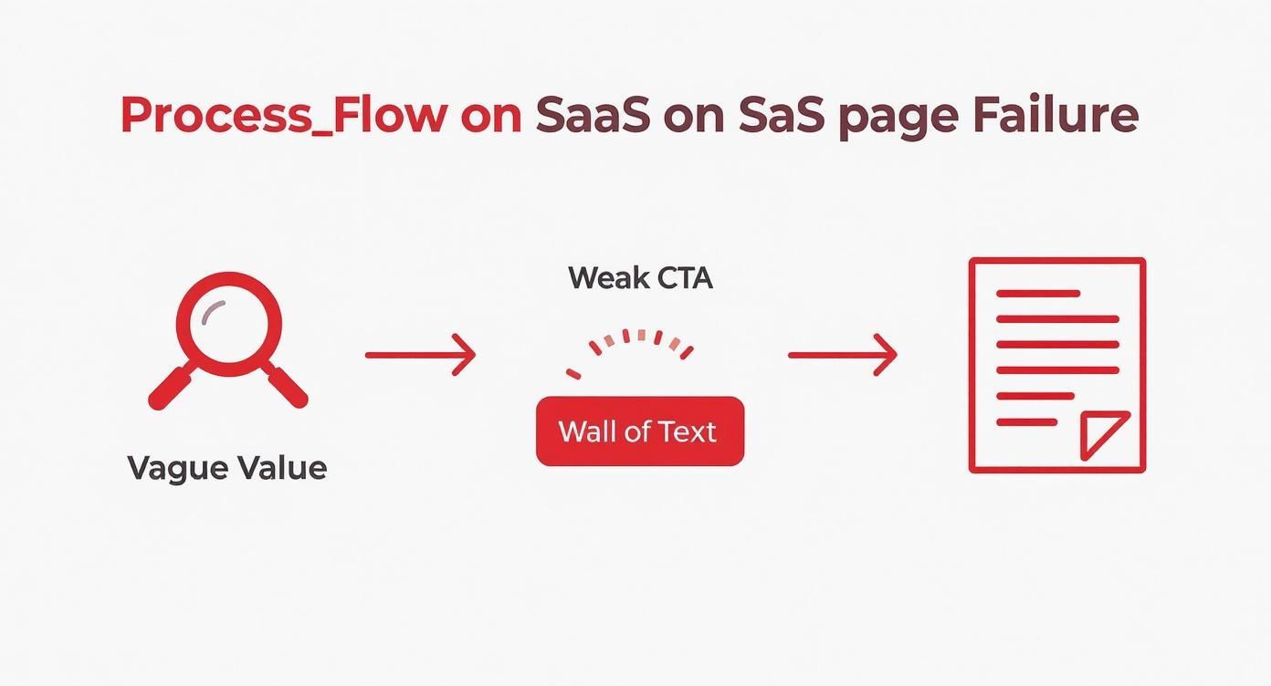
As you can see, a fuzzy value proposition is the first domino to fall, leading directly to uninspired calls to action and overwhelming content.
Mapping the User Journey
Once you’ve nailed your goal and sharpened your value proposition, you need to think about the visitor's state of mind. Where are they coming from? A Google ad? A social media post? An email newsletter? The context here is everything.
Someone who clicks an ad for "small business accounting software" has a completely different level of intent than someone who just read a detailed blog post about financial reporting. Your landing page has to meet them where they are.
- For high-intent traffic (e.g., from specific Google Ads): Your page can be more direct, focusing squarely on the sign-up or demo CTA. These visitors already know they have a problem and are actively hunting for a solution.
- For low-intent traffic (e.g., a link from a broad article): This page will need more educational content, social proof, and trust-building elements to gently guide them toward your conversion goal.
Understanding this journey is a core piece of building an effective lead generation system. The blueprint ensures your SaaS landing page is built for your audience and their specific needs—not for your company’s ego. This visitor-centric approach is the only way to create pages that don't just get traffic, but actually get results.
Designing for Persuasion, Not Just Aesthetics
Great design on a SaaS landing page isn’t about winning awards; it’s about winning customers. A truly effective page doesn't just look good—it guides a user toward a decision. It uses psychology and structure to make the next step, usually signing up, feel like the most logical and natural choice in the world.
To be blunt: a pretty page that doesn't convert is just a pretty failure. Your goal is persuasion, which means every colour, every font choice, and every bit of white space has to serve that one primary goal.
Mastering the Visual Hierarchy
Visual hierarchy is the secret weapon of high-converting landing pages for SaaS. It’s the art of arranging elements to show their order of importance, drawing the visitor’s eye exactly where you want it to go. Think of it as creating a visual roadmap for their attention.
You can control this flow using a few simple principles:
- Size: The most critical element, like your main headline, should be the largest. It’s the first thing people should read.
- Colour: A brightly coloured call-to-action (CTA) button will pop against a more neutral background. A vibrant orange button on a white page, for instance, is impossible to miss.
- Placement: We naturally perceive elements at the top and centre of a page as more important. This is precisely why your key value proposition should live "above the fold."
When you get this right, you stop leaving the user journey to chance. You're actively guiding them from your headline, to your benefits, through your social proof, and finally to that all-important CTA button.
The Unshakeable Power of Social Proof
No one wants to be the first person to try something new, especially in B2B. Scepticism is the default setting for most visitors, and social proof is your tool for dismantling that scepticism and building instant trust.
But this isn't just about slapping a few client logos on your page. Effective social proof is specific and relatable. A testimonial from a CEO at a recognisable company in your target industry is worth ten generic five-star ratings.
The most convincing claims aren't the ones you make about yourself, but the ones your happy customers make for you. It transforms your marketing from a sales pitch into a credible recommendation.
For example, a project management tool could feature a testimonial saying, “We cut our weekly meeting time by 50% with this tool.” That’s a powerful, tangible outcome that resonates far more than a simple feature list ever could.
A Controversial Take on Imagery
Those perfect, polished stock photos of smiling people in a boardroom are actively killing your conversions. They scream "fake" and do absolutely nothing to build credibility. In my experience, real, slightly imperfect images perform significantly better.
Think about it. Which of these is more believable?
- A stock photo of a diverse group of models pretending to collaborate.
- An actual screenshot of your software in action, solving a real problem.
- A candid photo of your team working on the product.
The second and third options build authenticity. They show there are real people and a real product behind the webpage. Airtable does a fantastic job of this, using clean product screenshots that demonstrate value without feeling overly staged. You can find a deeper analysis of this and other best practices for landing pages to see how small design choices create a big impact.
Ultimately, your goal is to create an experience that feels trustworthy and seamless. When a visitor feels you understand their problem and have a proven solution, clicking that sign-up button becomes an easy decision, not a leap of faith.
Crafting Copy That Connects and Converts
Your words are your single most powerful sales tool. It's time to stop writing copy that sounds like it was pulled from a corporate user manual and start writing like a human who gets the very real, very frustrating problem your customer is facing.
This is where so many landing pages for SaaS fall flat. They spend all their time talking about the tool, not the transformation.
The real goal is to get your reader nodding along as they scroll, thinking, "Finally, someone actually understands my situation." You get there by shifting your entire focus from what your product is to what it does for the person on the other side of the screen.
100% Free Lead Magnet Audit
Our AI analyzes your website and delivers custom growth strategies in seconds.
The Problem-Agitate-Solve Formula
One of the most effective copywriting frameworks I’ve ever come across is Problem-Agitate-Solve (PAS). It's simple, direct, and brutally effective because it taps directly into the emotional journey of someone desperately looking for an answer.
Here’s the breakdown:
- Problem: Kick things off by clearly stating the core problem your ideal customer has. It’s crucial to use the language they use. For example, "Tired of chasing clients for invoice payments?" resonates much more than "Our platform streamlines accounts receivable."
- Agitate: Don't just state the problem—pour a little salt in the wound. Remind them of the frustration, the wasted time, the real cost of doing nothing. "Every overdue invoice is a direct hit to your cash flow, not to mention another awkward follow-up email you have to write."
- Solve: Now, and only now, you bring in your product as the obvious hero. "Imagine a world where payments are automated, and you get paid on time, every single time. That's what we do."
This simple three-part story can form the entire backbone of a persuasive landing page. Your headline can state the problem, the sub-headline can agitate it, and the rest of the copy can present your elegant solution.
From Lifeless Features to Benefit-Driven Outcomes
Nobody actually cares about your features. What they care about is the result those features will create in their life or business. Your job is to connect those dots for them, clearly and compellingly.
We can do a quick teardown to see what this looks like in practice:
- Feature: "Our tool has AI-powered analytics."
- Benefit: "Make data-driven decisions in minutes, not hours."
The first one is a technical spec. It’s cold. The second is a promise of saved time and a smarter strategy. One is about your product; the other is about your customer's success. You should always be writing about the latter.
Your job isn't to list ingredients; it's to describe the delicious meal. Stop selling the drill and start selling the perfectly hung picture frame.
This one mindset shift will change everything about how you write. Go through your current landing page right now. For every feature you've listed, ask yourself "so what?" and write down the answer. That answer is your benefit.
Anatomy of Killer SaaS Copy
Let's look at how some companies absolutely nail this in the wild.
Take a look at Asana. Their headlines consistently focus on bringing clarity and reducing chaos—the very things their target audience craves. They don't lead with "Gantt charts and Kanban boards"; they lead with "Work on big ideas, without the busywork."
Another fantastic example is WeTransfer. Their copy is famously, beautifully simple. For years, their page basically said, "Send a file." It works because it’s laser-focused on the user’s immediate goal. It’s not about "cloud-based file transfer protocols"; it's about getting a task done, right now.
These examples work because they share a few key traits:
- Clarity over cleverness: The copy is dead simple to understand in seconds.
- Customer-centric language: They use "you" and "your" way more than "we" and "our."
- Focus on the end result: The words paint a clear picture of a better, easier future.
At the end of the day, writing great copy isn't about having a huge vocabulary. It's about having deep empathy. When you genuinely understand your customer’s pain, the right words have a way of finding you.
Making Your Landing Page a Two-Way Conversation
It's time we all agreed to leave static, boring landing pages for SaaS in the past. Seriously, why on earth would you ask a visitor to download yet another generic PDF when you can offer immediate, personalised value right there and then? The old way is a one-way street; the new way is a conversation.
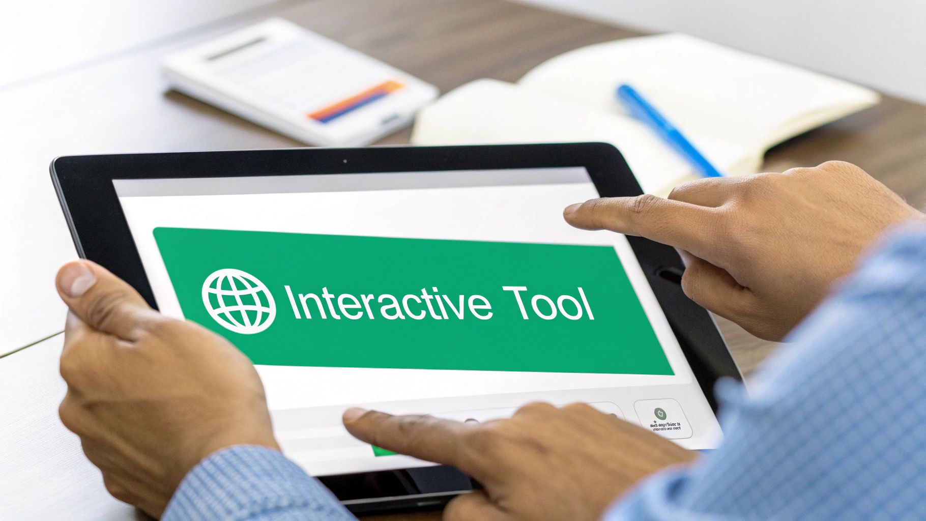
Interactive tools—think ROI calculators, diagnostic quizzes, or even simple graders—completely change the dynamic. They transform a passive browsing experience into an active, engaging one. You're giving visitors instant gratification while capturing genuinely qualified leads, because they're investing their time and attention to get an answer. I've personally seen a simple calculator I built for a client generate more high-quality, sales-ready leads than a dozen ebooks combined.
Why Static Content Is Fading Fast
The traditional lead magnet exchange is just plain tired. A visitor hands over their email, and you give them a document they'll probably never read. It's a low-value transaction that tells you next to nothing about their actual needs or intent. An interactive tool flips this entire model on its head.
It's about creating a genuine value exchange, not just a transaction. You're not gating information; you're providing an immediate, helpful experience that solves a small piece of their problem instantly.
This approach builds trust from the very first click. Instead of just telling them your software is valuable, you're showing them by helping them calculate, diagnose, or benchmark something important to their business.
Tools That Actually Generate Leads
Most AI-generated lead magnets are a dead end. They often feel generic, lack specific value, and fail to create that genuine "aha!" moment that a focused, interactive tool provides. They feel like homework, whereas a tool feels like a discovery.
Here are a few simple but incredibly powerful examples I've seen work time and time again:
- ROI Calculators: Let a visitor punch in a few numbers (like team size or current spending) and instantly see the potential financial impact of your solution. This immediately frames the conversation around value, not cost.
- Maturity Assessments: A short quiz that helps a visitor score their current processes is a brilliant move. At the end, you provide their score along with targeted advice, naturally positioning your SaaS as the logical next step.
- Configuration Tools: Allow users to build a "lite" version of a solution or plan. This gets them invested in the outcome and gives your sales team deep insight into their specific requirements before the first call even happens.
These tools don't need to be overwhelmingly complex. The goal is to provide a quick win for the user. As you build out your page, think about how these interactive elements fit into your wider strategy. Properly structuring them is a key piece of an effective sales funnel builder that guides users smoothly from curiosity to conversion.
Backing It Up with a Smart Strategy
Of course, engagement alone isn't enough; it has to lead to a conversion. Global trends show that while B2B SaaS companies often outperform B2C in trial-to-paid conversions, mobile conversion rates consistently lag behind desktop by a significant margin. This just highlights the absolute necessity of ensuring your interactive tools are not just engaging, but also fully responsive and easy to use on a smaller screen. Offering real value through persuasive content and reducing any friction are the keys to turning that engagement into a sign-up. You can discover more insights like these with the latest SaaS conversion rate benchmarks from Klickflow.
If you’re struggling to come up with ideas or wondering how effective your current lead magnet strategy really is, getting an outside perspective can be a game-changer. For instance, running your page through a free tool like the Magnethive audit can give you a clear, data-backed report and suggest tailored interactive ideas to replace your static content. It’s 100% free and provides a comprehensive analysis along with three AI-powered lead magnet suggestions.
Frequently Asked Questions
Building SaaS landing pages that actually convert can feel like trying to hit a moving target. I get asked a lot of questions by founders and marketers deep in the trenches, and a few key themes pop up time and time again. Let's tackle some of the most common ones.
How Many Landing Pages Should a SaaS Company Have?
The short answer is nearly always "more than one". While there isn't a single magic number, a solid rule of thumb is to create a unique landing page for each distinct campaign, audience segment, or traffic source.
Think about it this way: the Google Ads campaign you're running for "project management for small teams" should absolutely not point to the same page as your LinkedIn campaign targeting "enterprise workflow automation". By creating separate pages, you can tailor the messaging, the value proposition, and even the social proof to be hyper-relevant. That kind of specific targeting is what really moves the needle on conversion rates.
If you're just starting, focus on your homepage first. Then, build out dedicated pages for your top 2-3 acquisition channels.
What Is the Most Important Element on a SaaS Landing Page?
Every part of your page has a job to do, but if I had to pick just one, it's the "above the fold" section—everything a visitor sees the moment the page loads, without having to scroll. This small bit of screen real estate has to do all the heavy lifting.
If your headline, sub-headline, and hero image don't grab a visitor's attention and explain your value in the first 3-5 seconds, you've lost them. The rest of the page content becomes irrelevant because they'll never see it.
This critical first impression needs to nail your core headline, have a sub-headline that adds essential context, feature a compelling hero image or video showing your product in action, and present a crystal-clear call-to-action (CTA). Everything else on the page is there to back up the promise you make in this make-or-break section.
Should My SaaS Landing Page Have Pricing on It?
Ah, the classic debate. And the honest, if slightly frustrating, answer is: it depends.
Transparency can be a huge asset. If you have a straightforward, self-service pricing model with clear monthly tiers (think Basecamp or Slack), putting your prices right on the page builds immediate trust. It helps qualify leads on the spot and gets straight to the point.
On the other hand, if you’re selling a complex enterprise solution that requires custom quotes and a lengthy sales cycle, slapping a price tag on the page can be a bad move. A high number without context might scare off perfectly good leads before your team even has a chance to demonstrate the massive ROI you deliver. For these kinds of products, the goal of the landing page isn't a sale; it's to get them to book a demo or a call.
When in doubt, test it. Run an A/B test with one version showing pricing and another without, and let your conversion data tell you what your audience responds to.