High-Converting SaaS Landing Pages: A Founder's No-BS Guide
Discover how landing pages saas drive sign-ups with persuasive messaging, clean design, and interactive elements that convert visitors into customers.
SaaS landing pages are beasts of their own. They're not just any web page; they are hyper-focused machines designed to do one thing and one thing only: turn a visitor into a lead or a customer. That’s it. Their entire existence revolves around getting someone to take a single, specific action—like signing up for a free trial, booking a demo, or subscribing to a plan.
To do that, they have to nail the product's value proposition and steer the user straight towards that one conversion goal.
Why Your SaaS Landing Page Isn't Converting
I’ve seen it a thousand times: a brilliant SaaS product, completely kneecapped by a landing page that just doesn’t connect. You have a potential customer—your ideal user—showing up with a burning problem they need to solve. What do they find? A wall of jargon, a laundry list of features they don't recognise, and a vague promise of "increased efficiency."
They're gone in seconds.
The root of your problem isn't your product; it's a fundamental breakdown in communication. You’re so deep in the software that you’ve forgotten what it feels like to not know what "asynchronous processing" or "seamless API integration" actually means for someone's day-to-day work. This is the empathy gap, and it's silently murdering your conversions.
The Feature Dump vs The Benefit Promise
So many SaaS founders fall into the classic trap of listing features instead of selling benefits. Your page proudly shouts, "AI-powered analytics!" but your visitor is thinking, "So what? How does that save me from spending my entire Friday afternoon wrestling with spreadsheets?"
They don't care about your features; they care about the outcome your features deliver.
The most painful lesson I’ve learned is that nobody cares about your product’s features. They only care about what your product can do for them. It’s a subtle but crucial distinction that separates pages that convert from those that just exist.
This disconnect is where most landing pages for SaaS products stumble and fall flat. The fix isn't about dumbing down your message. It's about translating it into the language of your customer's pain points and aspirations. Many of these foundational issues can be fixed by applying proven strategies to increase website conversions, which are just as vital for SaaS.
The Fear of Being Different
Another silent killer? The crippling fear of standing out. We look at what our competitors are doing—the same generic stock photos, the same bland headlines—and we copy them, assuming it must be working. But this just creates a sea of sameness where your unique value gets completely drowned out.
Your landing page isn't just a digital brochure; it’s your best salesperson, on the clock 24/7. If that salesperson is boring, confusing, or sounds just like every other salesperson on the street, you're not going to make any sales.
I’ve built pages that flopped spectacularly for this exact reason. It was only when I stopped talking about what my tool was and started showing what a user's life would be like with it that the needle finally started to move.
Before we dive into the nuts and bolts of building, we have to fix this foundational problem. It’s about stepping out of your own shoes and into your customer’s—understanding their world and crafting a message that makes them feel seen, understood, and absolutely confident that you hold the solution to their problem.
Crafting Your Core Message Before You Build Anything
Before you touch a line of code, pick a colour palette, or even sketch a wireframe, we need to talk about the one thing that will either make your landing page fly or crash: your core message.
This isn’t just about a clever headline. It’s the entire foundation. If your message is weak, confusing, or screams "we sell features," the slickest design in the world won’t save your conversion rate.
I’ve made this mistake myself. I've jumped straight into building because the idea felt electric, only to end up with a page that looked great but felt hollow. Why? Because I skipped the hard work upfront—the part where you actually figure out the promise you’re making.
Let's not make that mistake. Let's get this right from the start.
Uncovering the Real Problem with JTBD
To nail your message, you have to stop thinking about your product and start obsessing over your customer's struggle. The "Jobs-to-be-Done" (JTBD) framework is your best friend here. It flips the script from "What does our product do?" to "What job is the customer hiring our product to do?"
Think about it. People don’t buy a drill because they want a drill. They buy one because they need a hole in the wall. Your SaaS is the drill; the job is the outcome they're desperate for.
- Are they trying to slash manual data entry so they can get their weekends back?
- Are they trying to look like a genius in front of their boss with slicker reports?
- Are they trying to kill the constant anxiety of not knowing where a project stands?
Those are the real drivers. Your messaging has to capture that emotional and practical context. This becomes your North Star, guiding every word you write and every button you place.
Translating Features into Benefits That Resonate
Once you know the "job," you can finally start talking about your product—but not in the way you think. This is where most SaaS pages fall flat on their face. They list features, not benefits. They explain what the software does, not what it does for me, the user.
Here’s a hard truth: nobody cares about your "AI-powered algorithm." They care about getting an answer without having to think.
Your job is to connect the dots. Don't make visitors work to understand your value. Someone should grasp the core benefit within five seconds of landing on your page, or they're gone.
Let's make this practical. This simple translation table forces you to see your product through your customer's eyes, turning tech jargon into promises they actually care about.
From Feature to Benefit: a Practical Translation
This table shows how to reframe common technical SaaS features into customer-centric benefits that drive conversions.
| Technical Feature | Customer-Focused Benefit | Example Headline Hook |
|---|---|---|
| Real-time analytics dashboard | Make smarter decisions, faster, without waiting for reports. | See Your Business Clearly |
| Automated workflow sequences | Stop wasting hours on repetitive tasks and focus on what matters. | Put Your Busywork on Autopilot |
| Role-based user permissions | Keep sensitive data secure and give your team exactly what they need. | Control Who Sees What, Effortlessly |
| Multi-channel integrations | Connect all your tools in one place; no more tab-switching chaos. | Your Entire Stack, Unified |
See how that works? This isn't just some academic exercise. This table gives you the raw material for your headlines, sub-headlines, and body copy. It's your messaging playbook.
Structuring Your Opening Hook
With your core benefits locked in, you can now build an opening that grabs your ideal customer by the collar. The goal is to make them feel seen and understood, instantly.
Your headline should promise the dream outcome. Your sub-headline should whisper how you make it happen.
A simple, powerful structure looks like this:
- Headline: A clear, benefit-driven promise. (e.g., "The Easiest Way to Manage Team Projects")
- Sub-headline: Briefly explains the "how" or twists the knife on a key pain point. (e.g., "Stop chasing updates in emails and chats. Get a clear view of everything your team is working on, instantly.")
- Opening Paragraph: Shows empathy for their current mess and positions your tool as the obvious way out.
This isn't about being clever; it’s about being brutally clear. Your message is the bedrock of your entire page. Build it on solid ground, and everything else you add on top will be that much stronger.
The Anatomy of a High-Performing SaaS Landing Page

Okay, you’ve nailed your core message. Now it’s time to actually build the page.
A killer SaaS landing page isn’t just a jumble of cool-looking sections. It's a story. A carefully constructed narrative that grabs a visitor by the collar and walks them from "What is this?" to "I need this." Each section has to build on the one before it, creating momentum and earning trust every step of the way.
Think of it less like a brochure and more like a conversation. You start with a bold opener, anticipate their questions, show them some proof, and then ask for the next step. If any part of that conversation feels off, they’re gone.
This isn’t about some rigid, one-size-fits-all template. It's a flexible framework built on psychology and logical flow. We can break down the essential pieces that make this story work.
The Hero Section Above the Fold
This is it. Your first impression. You’ve got about five seconds to convince someone to care.
What users see without scrolling has one job and one job only: get them to keep scrolling. Everything here must hammer home that core value proposition you worked so hard on.
- The Big Promise (H1): This is your main headline. No fluff. It has to scream benefits and be crystal clear.
- The Clarifying Sub-headline (H2): This sentence backs up the promise. It usually explains how you deliver on it or twists the knife on the pain point you’re solving.
- The Irresistible Call-to-Action (CTA): Your button needs to use action words that communicate value. "Start My Free Trial" absolutely crushes a lazy "Submit."
- The Visual Hook: This could be a slick product screenshot, a short GIF that shows off that "aha!" moment, or an illustration that paints a picture of their desired future.
Get this section right, and you've earned their attention. Fumble it, and they’re already hitting the back button.
Building Trust with Social Proof
The second you make a big promise, your visitor’s brain immediately asks, "Can I actually trust you?"
This is where social proof comes in. It’s not about stroking your own ego; it’s a powerful psychological shortcut that tells people your solution is a safe, smart choice.
Don't bury your best testimonials at the bottom of the page. Introduce social proof early, right below the hero section, to immediately address visitor skepticism and build credibility.
Your goal here is to show that other smart people—people just like them—have already chosen your product and are damn happy they did.
Some of the most effective forms of social proof for SaaS landing pages include:
- Customer Logos: Slapping logos of well-known companies that use your software on the page is an instant credibility boost. For example, seeing logos like Slack or Dropbox on a B2B tool's page provides immediate validation.
- Specific Testimonials: Ditch the generic praise. You want quotes that highlight a tangible result or a solved pain point. Make sure to include the person's name, title, and company.
- Case Study Snippets: Pull out a short summary from a success story with a juicy metric. Think, "Company X increased productivity by 40% in 60 days."
Showing The How with Benefit-Driven Features
Okay, you've hooked them and built a little trust. Now you can finally start explaining how your product actually works. But remember the golden rule: lead with benefits, not features.
This is where you break down your product's core powers into bite-sized chunks. A super common and effective pattern is the "alternating feature block"—an image or GIF on one side, benefit-focused text on the other, switching sides as the user scrolls down. It's simple, clean, and it just works.
Each of these blocks should follow a simple formula:
- Benefit-Oriented Headline: Focus on the outcome. "Automate Your Reporting in Minutes" is way better than "Reporting Feature."
- Explanatory Paragraph: Briefly explain the feature that makes this outcome possible.
- Visual Evidence: Show, don’t just tell. A GIF of the feature in action is worth a thousand words of jargon-filled text.
This approach walks the user through your product's value, piece by piece, making it dead simple to see how it solves their specific problems. You can explore more best practices for landing page design to really dial in this and other sections for maximum impact.
Finally, every great page needs a knockout closing argument. The final CTA section isn't just an afterthought; it’s your last chance to seal the deal. Say your main value prop one last time and give them a clear, compelling, and low-friction call to action. Erase any final doubts and make taking that next step feel like the most obvious decision in the world.
100% Free Lead Magnet Audit
Our AI analyzes your website and delivers custom growth strategies in seconds.
Ditch the Static PDF—Interactive Lead Magnets Are Your New Secret Weapon
I'm about to say something that might sting a little: that beautifully designed, 20-page PDF ebook you spent weeks creating? It's probably hurting your lead quality. I know, I know. But the hard truth is that static content is a one-way street, and on a SaaS landing page, that's a criminal waste of an opportunity.
Static lead magnets are completely passive. A user drops their email, grabs a document, and you're left crossing your fingers, hoping they actually read it and somehow connect the dots back to your product. It’s a total game of chance.
Interactive content flips the entire script. It starts a conversation.
Instead of just shouting information into the void, you're pulling the user into a two-way exchange. This is where you can truly cut through the noise. It’s about morphing your landing page from a flat, boring brochure into a living, breathing experience that starts solving a tiny piece of their problem from the very first click.
Why a Simple Calculator Beats a Complex Whitepaper Every Time
I’ve had more success with a simple ROI calculator I knocked together in a weekend than with some of the most exhaustive whitepapers I've ever poured my soul into. The reason is simple: the calculator delivers immediate, personalised value.
A user doesn't have to wade through 5,000 words to find the one nugget that applies to them. They punch in their own numbers and instantly see a result that is all about them. That little spark of personal relevance is ridiculously persuasive.
- Quizzes: Let prospects self-diagnose their biggest headache, naturally guiding them toward the exact part of your solution that solves it. A project management tool could offer a "What's Your Team's Productivity Bottleneck?" quiz.
- Assessments: Give them a grade on their current setup or maturity level, shining a spotlight on the very gaps your software was designed to fill. A cybersecurity SaaS could provide a "Business Security Score" assessment.
- Calculators: Show them the money. Turn a vague promise of "efficiency" into a hard number representing potential cost savings or revenue gains. A marketing automation platform could build a "Calculate Your Potential Lead Gen ROI" tool.
This isn’t about building some crazy, AI-driven behemoth. More often than not, the simplest tools are the most deadly. A basic "How much could you save?" calculator can generate not just leads, but highly qualified, segmented leads who have already sold themselves on your value prop.
The goal isn’t to give away your product for free. It’s to give away a small piece of the outcome your product delivers. When someone experiences that value firsthand, the sale becomes exponentially easier.
This active engagement does more than just snag an email. It hands you a treasure trove of zero-party data. You learn about their team size, their specific pain points, and their goals—gold-plated info you can use to tailor every follow-up and sales call. You're no longer starting cold; you're starting with genuine insight. For a deeper look at why this works so well, check out the definitive guide on why interactive tools are better than PDFs for lead generation.
You Don't Need a Team of Developers to Pull This Off
The biggest myth holding people back is that building interactive tools requires a massive budget and a dedicated dev team. That’s just not true anymore. I've built killer tools using no-code platforms and simple spreadsheet formulas embedded on a page.
Your focus should be on the value, not the technical wizardry. A tool that answers one burning question for your prospect is infinitely more valuable than a flashy widget that does nothing. It immediately positions your SaaS as a problem-solver.
Here's a peek at how our free audit tool spits out AI-powered lead magnet ideas.
This report provides instant, personalised suggestions. It turns a passive visit into an active strategy session.
This approach completely reframes the user's mindset. They aren’t just downloading another resource; they are actively diagnosing their own needs with your guidance. And if you really want to pour gasoline on your lead capture, think about implementing a dedicated lead generation chatbot. You can set one up in minutes and create a very similar conversational experience.
From Passive Download to Active Qualification
Let's get real about the impact on your pipeline. A lead from a PDF download is basically just an email address with an assumed interest. A lead who completes an assessment, though? That's a different animal entirely.
- They've invested time: They spent several minutes answering questions. That shows a much, much higher level of intent.
- They've self-segmented: Their answers tell you exactly what they care about and where they are in their journey.
- They've received value: They got a personalised report or score, creating a positive first impression of your brand before you’ve even spoken.
This is the difference between a cold list and a warm, pre-qualified pipeline. It fundamentally changes the dynamic of your sales process, setting you up for far more meaningful—and successful—conversations.
If your current lead magnet strategy feels like you're just throwing stuff at a wall to see what sticks, you might need an audit. Our free tool, Magnethive, can generate a full report on your current lead magnet, providing 3 AI-powered ideas and showing potential ROI impact.
Implementing and Measuring Your Interactive Landing Page
Having a brilliant idea for an interactive tool is one thing. Actually getting it built, slapped on your landing page, and measured is where the real work begins. An unmeasured tool is just a fancy gimmick. But a properly tracked one? It turns your landing page into a data-gathering machine that fuels both your marketing and product teams.
Execution is everything. The goal isn't just to make the page interactive—it's to make that interaction a seamless, natural part of the user's journey. It has to feel like it belongs on your site, not like some clunky, third-party widget you just dropped in. Technical hiccups or a jarring user experience will kill engagement before it even starts.
From Idea to Embedded Tool
First things first: you need to get your quiz, calculator, or assessment live on your page. How you do this depends entirely on the tool you're using. If you’ve built something custom from scratch, you'll be working with your developers. For the rest of us, no-code and low-code builders are the fastest way to get this done.
Most of these platforms will spit out a simple embed code. This is usually a small snippet of JavaScript you can paste directly into your landing page builder, whether you’re using Webflow, HubSpot, or a custom CMS.
Your main focus during this step should be the user experience. No excuses here.
- Loading Speed: The tool has to load fast. A slow, lagging calculator will cause people to bounce before they even see the first question.
- Mobile Responsiveness: It absolutely must look and work perfectly on mobile. A huge chunk of your traffic will come from phones, and a broken experience there is a deal-breaker.
- Brand Consistency: The tool should match your brand’s colours, fonts, and overall vibe. It needs to feel like a cohesive part of the experience.
Tracking What Actually Matters
This is where so many people completely drop the ball. They launch a cool new tool and then stare at vanity metrics like page views or how many people started it. Those numbers might feel good, but they tell you almost nothing about performance.
We need to track metrics that give us actionable insights. We're not just looking for numbers; we're hunting for answers to specific questions about user behaviour. Forget the fluff.
The most powerful thing about interactive content isn't just the leads it generates, but the data it provides. Every click, every answer, every drop-off point is a piece of feedback telling you exactly how to make your marketing better.
We should focus on the metrics that actually drive business decisions:
- Completion Rate: This is your North Star. What percentage of users who start the tool actually finish it and see their results?
- Question Drop-off: On which specific question are most users bailing? This is a massive red flag telling you a question is too confusing, too personal, or just plain boring.
- Lead Quality Score: Based on their answers, how qualified is this lead? You can create a scoring system that flags high-intent prospects for an immediate sales follow-up.
- Conversion to Customer: This is the ultimate test. Of the leads this tool generates, how many eventually become paying customers? This ties your efforts directly to revenue.
This infographic lays out the fundamental difference in the journey—and quality—between leads from old-school static content versus interactive tools.
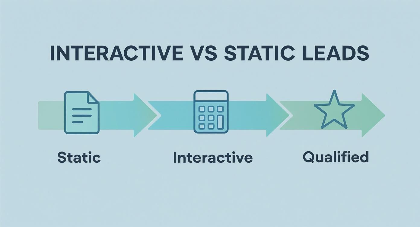
You can see it right there. Interactive tools add a crucial qualification step, turning a vague interest into a well-defined, actionable lead for your sales team.
Creating Your Feedback Loop
Once you set up proper tracking, you create a powerful feedback loop. You're not just guessing anymore; you're making data-informed decisions. For instance, if you see a huge drop-off on question three of your quiz, you can hypothesise why, tweak the question, and measure the impact on your completion rate.
This cycle of measuring, analysing, and optimising is what separates high-performing landing pages saas from the ones that just sit there. It’s not a one-and-done activity. Your interactive tool becomes a living, breathing part of your marketing, constantly evolving based on how real people use it. If you want to build a solid framework for this, our guide on creating a complete lead generation system dives deeper into structuring these feedback loops.
Recent benchmarks show that well-optimised SaaS landing pages can hit a median conversion rate of around 6.6% in competitive markets. That’s a huge jump from the general SaaS website average of 2-5%, and it highlights the impact of a focused, measured approach. You can discover more insights about landing page statistics to see how your own efforts stack up. This performance gap is often closed by the granular insights you get from carefully measuring every single user interaction.
Your Burning SaaS Landing Page Questions, Answered
Let's get into the weeds. Building a landing page that actually works means sweating the details. These are the questions that come up time and time again—the ones that can make or break your conversion rates.
Getting these right is the difference between a page that drives demos and a page that just… sits there.
How Long Should My SaaS Landing Page Be?
There’s no magic number here. I've seen short, snappy pages crush it for simple tools. I've also seen massive, long-form pages work wonders for complex products that need a lot of trust-building.
The real answer? It should be as long as it needs to be to make your case, and not one word longer.
Forget page length. Ask this instead: "Does every single section on this page push the visitor closer to saying 'yes'?"
- For a simple free trial: Shorter is almost always better. Get straight to the point, hammer home the main benefit, and make that CTA impossible to miss.
- For a high-ticket demo: You're going to need more runway. This means more social proof, more detailed feature breakdowns, and actively tackling potential objections before they even form in the visitor's mind.
The trick is to match your page length to your visitor's awareness and the complexity of what you're asking them to do. Don't add fluff to fill space. Every section needs a job.
Should I Use a Video on My Landing Page?
Video can be a game-changer, but it's not a cure-all. A great video can explain a complicated product in seconds and forge a real human connection. A bad one? It’ll tank your credibility and slow your page to a crawl.
Here's a hot take: most of the time, video is a crutch for weak copy. Teams often slap a video on the page hoping it'll do the heavy lifting, when the real issue is that their core message isn't clear in the first place.
Before you go down the video rabbit hole, ask yourself:
- Could a quick GIF or a few well-placed screenshots explain this just as well?
- Does this video offer something text and images can't—like showing off the product's buttery-smooth UI or the founder's genuine passion?
If you do go with video, keep it tight. Under 90 seconds is a solid rule. And make sure those first 10 seconds are absolutely magnetic. Oh, and never, ever auto-play with the sound on. Please.
What Should I A/B Test First?
It's so easy to get lost testing tiny things that make zero difference. Don't be the person who starts by testing button colours. That’s a rookie move that just burns through time and traffic.
Your first tests should always be the big swings—the changes with the highest potential to actually move the needle.
The goal isn't just to get more clicks. It's to find the message that truly resonates with your ideal customer. Big tests on your core message will teach you more about your audience than a hundred tiny button tweaks ever could.
Here’s how to prioritise your A/B tests:
- Your Headline & Value Proposition: This is it. The single most important element on the page. Test a completely different angle or a totally different benefit.
- Your Call-to-Action (CTA): Before you tweak the button text, test the offer itself. Is "Start Free Trial" more appealing than "Book a Demo"?
- Your Page Layout & Flow: Try reordering your sections. What happens if you move social proof right below the hero? Does it build trust earlier and lift conversions?
How Can I Start with Interactive Content on a Budget?
Building an interactive quiz or calculator sounds expensive and complicated, right? It doesn't have to be. You absolutely do not need a team of developers or a massive budget to get started.
The secret is to start embarrassingly small. Focus on giving your visitor a quick, tangible win.
Forget building some complex, multi-step assessment tool. Think simpler.
- Whip up a quiz in Typeform or Jotform: You can create a simple diagnostic quiz in an afternoon that helps visitors pinpoint their biggest challenge—and perfectly positions your SaaS as the solution.
- Embed a simple calculator: Tools like Calconic let you build and embed an ROI or savings calculator without writing a line of code.
The goal here isn't technical perfection. It's immediate value. If you're stuck for ideas or want to see how your current lead magnet stacks up, a free tool like Magnethive can generate a full report with AI-driven ideas and ROI projections to get you moving in the right direction.