10 Landing Page Best Practice Rules for 2025
Discover the top 10 landing page best practice rules you need for higher conversions. Learn how to optimise headlines, CTAs, and interactive content.
You've done everything right. You've driven traffic, your ad copy is sharp, but your conversion rates are flat. It’s a frustrating problem, right? You feel like you're just one tweak away, but most landing page advice recycles the same tired tips, leaving you with a page that looks professional but fails to connect and convert. We often treat landing pages like digital brochures when they should be dynamic, personalised experiences.
This isn't just about tweaking button colours or headlines; it's about fundamentally rethinking how we engage with a visitor in that critical first moment. A truly effective page goes beyond aesthetics. For a comprehensive overview of effective landing page creation that goes beyond just 'good enough', refer to a guide on comprehensive landing page design best practices.
In this breakdown, we're ditching the generic fluff and focusing on the strategic, often-overlooked landing page best practice that turns passive visitors into qualified leads. I've built and obsessed over interactive funnels that consistently hit 40-55% conversion rates, and it starts with getting these core principles right. The secret is moving beyond static PDFs to interactive tools that deliver instant, tangible value to your audience. We'll explore exactly how to implement these high-impact strategies to build pages that don't just look good, but actively work for you.
1. Clear and Compelling Headline
Your headline is the first, and sometimes only, chance to capture a visitor's attention. It must instantly communicate your unique value proposition (UVP), answering the crucial question in your visitor's mind: “What’s in it for me?” This isn't just about being clever; it's about clarity and delivering a benefit-driven promise in under eight seconds.
A powerful headline acts as a filter, qualifying the right audience and repelling the wrong one. If your landing page promotes an interactive ROI calculator, a headline like "Calculate Your Potential Savings in 60 Seconds" is far more effective than "Advanced Financial Modelling Tool". The first promises a clear, immediate benefit, while the second describes a feature.
How to Implement This Practice
This is a fundamental landing page best practice because it sets the stage for the entire user journey. To nail your headline, focus on the end result for your user.
- Benefit Over Feature: Don’t sell the drill; sell the hole. Instead of "AI-Powered Content Generation," try "Create High-Converting Blog Posts 10x Faster."
- Maintain Scent: Ensure your headline perfectly matches the ad copy that brought the visitor to the page. A disconnect between the ad's promise and the landing page's headline is a primary cause of high bounce rates.
- A/B Test Relentlessly: Never assume your first headline is the best. Continuously test 3-5 variations focusing on different angles: urgency, social proof, or a direct question. Tools like Google Optimize or VWO make this straightforward.
- Use Power Words: Words like "unlock," "discover," "transform," and "guaranteed" can significantly lift engagement by evoking emotion and promising a tangible outcome.
2. Single-Focused Call-to-Action (CTA)
A landing page must have a singular purpose, and its call-to-action (CTA) is the primary vehicle for achieving that goal. Every element on the page, from the headline to the imagery, should guide the visitor toward one specific action. Introducing multiple CTAs, like "Download Our Ebook" alongside "Book a Demo," creates decision paralysis, diluting focus and crippling your conversion rate.
The goal is to remove all friction and ambiguity. Your visitor should never have to wonder, “What should I do next?” The path forward must be obvious, visually prominent, and compelling. This is why you'll see successful brands like Evernote and Asana commit to one primary button, using high-contrast colours to make it impossible to miss.
How to Implement This Practice
This is a non-negotiable landing page best practice because a confused visitor will almost always leave. To make your CTA effective, it must be the undeniable focal point of the page.
- Be Singular: Remove all competing links and secondary buttons. This includes navigation bars, social media icons, and footer links that aren't essential to the conversion goal. Your landing page is not your homepage; it’s a conversion machine.
- Use Action-Oriented, First-Person Language: Shift the perspective from commanding the user to empowering them. Instead of "Submit Your Information," test copy like "Get My Free Audit" or "Start My Trial." This simple change can create a powerful sense of ownership.
- Design for Prominence: Your CTA button must stand out. Use a high-contrast colour that draws the eye, surround it with plenty of whitespace to avoid visual clutter, and place it strategically above the fold and again near the end of the page.
- Create Value-Driven Urgency: The copy should reinforce the benefit of clicking now. Phrases like "Claim Your Spot" or "Get Instant Access" are more effective than a generic "Click Here" because they promise an immediate and valuable outcome.
3. Minimal Form Fields
Every field you add to a form creates friction, acting as a small barrier between the user and the conversion goal. The core principle is simple: only ask for the information you absolutely need at that moment. Each additional field can decrease completion rates, so your form should strike a delicate balance between gathering valuable data and maximising conversions.
This trade-off is crucial. Asking for a phone number might seem useful for your sales team, but is it worth losing 30% of potential leads who are hesitant to share it? For a top-of-funnel offer like a webinar, a form with just an email field will almost always outperform one asking for name, company size, and job title. The goal is to make saying "yes" as easy as possible.
How to Implement This Practice
Reducing form friction is a powerful landing page best practice because it directly impacts your conversion rate. It shows respect for the user's time and privacy, building trust from the first interaction.
- Start with the Essentials: For initial conversions, an email address is often all you need. You can gather more information later. HubSpot's webinar sign-ups, for example, typically ask for only four core fields to reduce friction.
- Embrace Progressive Profiling: Don’t ask for everything at once. Use marketing automation to ask for more information over time. Once you have their email, your next interaction could ask for their company name, and the one after that could ask for their job title.
- Clearly Mark Optional Fields: If you must include fields that are not essential, make sure they are clearly labelled as "optional". This gives users control and reduces the perceived effort required to complete the form.
- Test Form Length: Don't just assume shorter is better. A/B test a single-field form against a three-field version. You might find that adding one or two key fields provides enough data to improve lead quality without significantly harming your conversion rate.
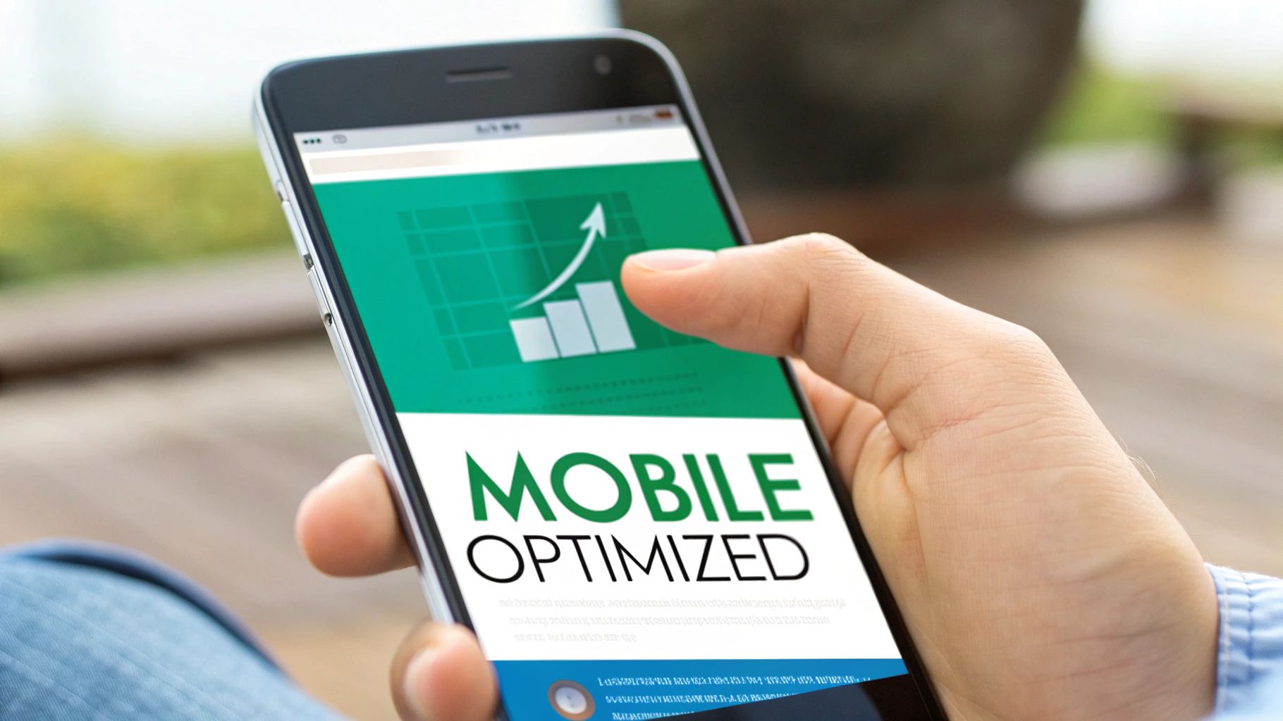
4. Mobile Optimisation and Responsive Design
With over 60% of web traffic now originating from mobile devices, treating the mobile experience as an afterthought is a costly mistake. Mobile optimisation isn’t just about making your page shrink to fit a smaller screen; it’s about redesigning the user journey for touch-based interaction, slower connections, and on-the-go attention spans. A clunky, slow-loading mobile page is one of the fastest ways to lose a potential lead.
A seamless mobile experience ensures your interactive tools, forms, and calls to action are not just visible but fully functional and easy to use. Think of Airbnb's booking process or Uber's sign-up flow; they are designed with a mobile-first philosophy, prioritising clarity and speed. This approach signals to visitors that you value their time, regardless of the device they use.
How to Implement This Practice
This is a non-negotiable landing page best practice because failing here means alienating the majority of your potential audience. To create a superior mobile experience, you must think beyond simple responsiveness.
- Prioritise Speed: Mobile users are impatient. Compress images, minify CSS and JavaScript, and leverage browser caching to ensure your page loads in under three seconds.
- Design for Touch: Ensure buttons and interactive elements are large enough to be easily tapped with a thumb. Avoid tiny text links and provide ample spacing between clickable elements to prevent frustrating mis-taps.
- Simplify Forms: Typing on a mobile device is cumbersome. Reduce the number of form fields to the absolute minimum. Use features like autofill and larger input fields to make the process as painless as possible.
- Test on Real Devices: Browser simulators are helpful, but they don't replicate the real-world experience of different network speeds, screen glares, and touch sensitivities. Always test your landing page on actual iOS and Android devices.
5. Social Proof and Trust Elements
Visitors are naturally sceptical. They’ve been burned by over-the-top promises before, so why should they trust you? Social proof addresses this head-on by leveraging the psychological principle of conformity: if other people like and trust you, new visitors are more likely to do the same. It’s the digital equivalent of seeing a crowded restaurant versus an empty one.
Strategically placed testimonials, client logos, user reviews, and case studies reduce friction and anxiety, validating a visitor's decision to engage with your offer. For example, showcasing logos from recognisable companies like Stripe or Salesforce immediately borrows their authority, giving your brand an instant credibility boost without you saying a word.

How to Implement This Practice
This is a critical landing page best practice because it builds the trust necessary for a visitor to hand over their contact information. To effectively implement social proof, make it authentic and specific.
- Quantify Results: Move beyond vague praise. Instead of "We loved working with them," use a testimonial that says, "Their solution helped us generate an additional £250,000 in pipeline." Specific numbers are more believable and impactful.
- Use Authentic Faces: Whenever possible, include a clear photo, name, title, and company for each testimonial. This humanises the review and makes it far more credible than an anonymous quote.
- Place It Strategically: Don't hide your social proof at the bottom of the page. Position your strongest testimonials or logos directly beside your primary Call-to-Action (CTA) to overcome last-minute hesitation.
- Leverage Video: Video testimonials are incredibly powerful. Hearing a customer describe their success in their own voice creates a much deeper emotional connection and is harder to fake.
6. Value Proposition and Benefit-Driven Copy
Beyond a great headline, your entire page must be saturated with a clear value proposition. Visitors are constantly assessing whether your offer is worth their time and data. Your copy's job is to stop them from asking, "So what?" by focusing relentlessly on the benefits they will gain, not the features you offer. It's the difference between describing an umbrella and selling a dry walk in the rain.
Effective benefit-driven copy translates your solution into the visitor's desired future state. For instance, Slack’s famous "Where work happens" isn't a feature list; it's a promise of a centralised, less chaotic work life. The value is immediately clear and emotionally resonant, making the decision to learn more a simple one.
100% Free Lead Magnet Audit
Our AI analyzes your website and delivers custom growth strategies in seconds.
How to Implement This Practice
This is a crucial landing page best practice because it forms the core of your persuasive argument. To craft compelling, benefit-driven copy, you must get inside your customer's head.
- Translate Features into Outcomes: Don't just state "Real-time Analytics Dashboard." Instead, write "Make Smarter Decisions, Faster, with Instant Performance Insights." Connect every feature to a tangible business or personal outcome.
- Speak to the 'Before and After': Frame your copy around the transformation. Describe the pain of their current state (the 'before') and paint a vivid picture of the relief and success your solution provides (the 'after').
- Use Specifics and Numbers: Vague promises are forgettable. "Boost efficiency" is weak. "Cut your project reporting time by 50%" is a powerful, concrete benefit that resonates with a specific pain point.
- Avoid Jargon: Your visitors are experts in their problems, not necessarily in your industry's buzzwords. Use clear, direct language that speaks to them on their terms. This is especially vital when creating landing pages for SaaS products, where technical jargon can be a major conversion killer.
7. Above-the-Fold Optimisation
The 'above the fold' area, the section of your page visible without scrolling, is your prime digital real estate. It’s where first impressions are formed and snap judgments are made. This space must immediately convey your core value proposition and guide the user toward your primary call-to-action (CTA), all before they have a chance to even think about scrolling.
Effective above-the-fold design grabs attention, clarifies your offer, and presents the most critical elements upfront: your headline, a supporting sub-headline, a compelling hero image or video, and the CTA button. If this area fails to engage, visitors will bounce without ever seeing the rest of your meticulously crafted page. Think of it as the cover of a book; if it isn't compelling, no one will bother to read the first chapter.
How to Implement This Practice
This is a non-negotiable landing page best practice because it dictates whether a user gives you five seconds or five minutes of their time. To optimise this space, you must be ruthless with your messaging and design choices.
- Make the CTA Unmissable: Your primary call-to-action button must be clearly visible without any scrolling. Use a contrasting colour to make it pop and ensure the copy is action-oriented (e.g., "Get Your Free Demo" instead of "Submit").
- Prioritise Clarity and Conciseness: Your headline and sub-headline should deliver the core message in seconds. Avoid clutter at all costs. Every element, from text to imagery, must serve the singular goal of encouraging the desired action.
- Use High-Impact Visuals: A professional, relevant hero image or a short, silent background video can communicate your value far faster than text alone. Test different approaches; for some offers, an authentic photo works best, while for others, a clean illustration is more effective.
- Avoid Early Annoyances: Never autoplay video with sound or hit users with an intrusive pop-up the moment they land. These tactics create a negative first impression and are a fast track to a high bounce rate.
8. Page Speed and Performance Optimization
In the world of instant gratification, page speed isn't a technical detail; it's a core component of the user experience. A visitor’s patience is incredibly thin, and a slow-loading landing page is one of the fastest ways to lose a potential lead. Research consistently shows that even a one-second delay can cause a significant drop in conversions, as users will abandon a page before your compelling headline even loads.
High-performance pages signal professionalism and respect for the visitor's time. Giants like Amazon and Google have set the standard, aiming for sub-second load times because they understand the direct correlation between speed and revenue. A fast, fluid experience keeps users engaged and focused on the value you offer, rather than being frustrated by a lagging interface.
How to Implement This Practice
Optimising for speed is a fundamental landing page best practice that directly impacts both user satisfaction and your bottom line. To ensure your page is lightning-fast, you must treat performance as a priority from the start.
- Audit and Diagnose: Begin by running your landing page URL through tools like Google PageSpeed Insights or GTmetrix. These will provide a detailed report card and pinpoint specific areas for improvement, from oversized images to inefficient code.
- Optimise Visuals: Large, unoptimised images are often the primary cause of slow load times. The most impactful way to boost performance is by compressing images for faster website load times, ensuring visitors don't bounce due to slow loading visuals.
- Minimise Code and Requests: Every script, stylesheet, and image on your page is a separate request the browser must make. Minify your HTML, CSS, and JavaScript to remove unnecessary characters and combine files where possible to reduce the total number of requests.
- Leverage Browser Caching: Configure your server to tell browsers to "remember" parts of your page. When a visitor returns, their browser can load the page from its local cache instead of re-downloading everything, dramatically improving load speeds for repeat traffic.
9. A/B Testing and Continuous Optimisation
Data-driven assumptions are just that: assumptions. The only way to truly know what resonates with your audience is to test it. A/B testing, or split testing, is the process of comparing two versions of a webpage to see which one performs better. By systematically changing one element at a time, you can incrementally improve your conversion rates and build a high-performing asset.
Relying on "best practices" alone is a recipe for mediocrity. What works for one audience can completely fail for another. For instance, a simple test changing a form from three fields to two might seem minor, but for ConvertKit, similar tests revealed major impacts on sign-ups. This is the core of continuous optimisation: small, validated wins compound over time into significant growth.
How to Implement This Practice
This is a non-negotiable landing page best practice because it removes guesswork from your marketing strategy. To build a robust testing culture, focus on a disciplined process.
- Prioritise High-Impact Elements: Don't start by testing the colour of a minor link. Focus on the big levers first: your headline, the call-to-action (CTA) button copy, the hero image, and the number of form fields.
- Test One Variable at a Time: If you change the headline and the CTA button simultaneously, you'll never know which change drove the result. Maintain scientific rigour by isolating one variable per test for clear, actionable insights.
- Use Heatmaps to Find Opportunities: Tools like CrazyEgg or Hotjar show you where users are clicking and scrolling. Use this data to identify friction points or areas of interest that are prime candidates for your next A/B test.
- Document Everything: Maintain a simple log of every test you run: what you tested, your hypothesis, the duration, the results, and the final decision. This prevents re-running old tests and builds an internal knowledge base of what works for your specific audience.
10. Consistent Messaging and Design Alignment with Source
A landing page never exists in a vacuum; it’s the destination of a journey that began somewhere else, like an ad, an email, or a social media post. When a visitor clicks a link, they carry an expectation. Consistent messaging and design ensure the page they land on instantly confirms they've arrived at the right place, a principle known as 'message match' or 'ad scent'.
This alignment is critical for building immediate trust and reducing cognitive dissonance. If a Facebook ad features a bright blue colour scheme and promises a "Free SEO Audit," but the landing page is green and talks about a "Website Performance Report," the visitor feels disoriented. This disconnect is a major cause of high bounce rates, as it forces the user to re-evaluate their decision to click, often leading them to abandon the page.
How to Implement This Practice
This is a fundamental landing page best practice because it creates a seamless and reassuring user experience from the first click to the final conversion. To master message matching, think of your ad and landing page as two halves of the same conversation.
- Mirror Ad Copy and Offer: Your landing page headline should directly reflect or closely match the headline of the ad that brought the visitor. If your Google Ad says, "Unlock Your SaaS Trial," the landing page should not say, "Request a Demo." The offer, discount, and terms must be identical.
- Maintain Visual Harmony: Use the same imagery, colour palette, and fonts from your source creative on the landing page. This visual continuity makes the transition feel natural and professional, reinforcing brand recognition and trust.
- Use Dynamic Text Replacement (DTR): For paid search campaigns, use DTR to automatically insert the keyword the user searched for into your landing page headline. This creates a hyper-relevant experience, confirming you have the exact solution to their query.
- Create Campaign-Specific Pages: Avoid sending all traffic to a generic homepage. Instead, create dedicated landing pages for each major campaign or ad group. This allows you to tailor the message, design, and offer with precision, dramatically improving conversion rates.
10-Point Landing Page Best-Practices Comparison
| Item | Implementation 🔄 (complexity) | Resources ⚡ (requirements) | Expected Outcomes 📊 (impact) | Ideal Use Cases 💡 | Key Advantages ⭐ |
|---|---|---|---|---|---|
| Clear and Compelling Headline | Low–Medium: copywriting + quick tests | Low: copywriter, basic A/B tooling | Faster attention capture; ↓ bounce up to ~40% | Hero sections, paid ads, first-time visitors | Grabs attention and sets expectation |
| Single-Focused Call-to-Action (CTA) | Low: design & placement changes | Low: designer, analytics | ↑ conversions ~35–50%; clearer UX | Signup/purchase funnels, landing CTAs | Reduces decision paralysis; easier tracking |
| Minimal Form Fields | Low–Medium: UX work, optional backend changes | Medium: form system, integrations, progressive profiling | ↓ form abandonment 20–40%; faster completions | Lead capture, webinar signups, trials | Low friction → higher completion and lead quality |
| Mobile Optimization & Responsive Design | Medium–High: responsive layouts & testing | High: frontend dev, QA on devices, performance tools | ↑ mobile conversions; better SEO; ↓ mobile bounce | Mobile-heavy traffic, apps, local services | Consistent UX across devices; improved rankings |
| Social Proof & Trust Elements | Low–Medium: collect & design testimonials/logos | Medium: content gathering, design assets, possible video | ↑ conversions 15–50%; reduced perceived risk | B2B, high-ticket offers, unfamiliar brands | Builds credibility and reduces purchase anxiety |
| Value Proposition & Benefit-Driven Copy | Medium: research + strategic copywriting | Medium: audience research, skilled copywriter | ↑ relevance; conversions +20–40%; clearer ROI | Complex offers, B2B, onboarding flows | Communicates outcomes and emotional value |
| Above-the-Fold Optimization | Low–Medium: layout prioritization | Medium: designer, hero media (image/video) | Immediate impact on scroll/exit; ↑ engagement | Paid traffic landing pages, homepages | Ensures core message and CTA are seen first |
| Page Speed & Performance Optimization | High: technical optimization & monitoring | High: developers, CDN, tooling, ongoing maintenance | ↑ conversions (≈7% per 1s improvement); better SEO | High-traffic or e‑commerce sites, global audiences | Faster loads → better conversions and lower costs |
| A/B Testing & Continuous Optimization | Medium–High: process, analysis, tooling | Medium–High: testing platform, analyst time, sample size | Incremental, evidence-based conversion gains over time | Mature funnels, teams focused on growth | Data-driven wins; avoids assumption-based changes |
| Consistent Messaging & Design Alignment with Source | Medium: create variants and manage campaigns | Medium: design, campaign assets, dynamic text tools | ↓ bounce 20–40%; ↑ conversion and ad quality scores | Paid ads, email funnels, segmented campaigns | Increases relevance and trust; improves ROI |
Stop Building Pages and Start Building Experiences
We have navigated through a comprehensive list of landing page best practices, from crafting compelling headlines and optimising calls-to-action to ensuring mobile responsiveness and leveraging social proof. Each principle, from A/B testing to maintaining message consistency, represents a critical lever you can pull to improve your conversion rates. Mastering these technical and strategic elements is the foundation of high-performance marketing. It is the disciplined work that separates campaigns that merely exist from those that excel.
However, the ultimate takeaway transcends any single optimisation tactic. The most profound shift you can make is to stop thinking about your landing page as a static digital brochure and start envisioning it as a dynamic, interactive experience. A perfectly optimised page is only half the battle; the other half is the value exchange you offer. This is where the true potential for conversion lies. The future of lead generation is not just about refining the container, it's about revolutionising the content within it.
From Transaction to Interaction
Frankly, your landing page might not be the problem—your offer could be. A flawlessly designed page promoting a generic, static PDF will almost always be outperformed by a simpler page that offers an engaging, interactive tool. The ultimate landing page best practice is to present something so valuable and instantly gratifying that visitors are compelled to engage.
This approach fundamentally changes the user's journey:
- Instead of asking for an email for a guide, you offer a personalised assessment.
- Instead of gating a whitepaper, you provide a custom ROI calculator.
- Instead of offering a standard case study, you build a diagnostic quiz that helps them identify their own challenges.
This transforms the dynamic from a one-way transaction (their email for your content) into a two-way conversation. You are not just capturing a lead; you are delivering immediate, tangible value, building trust, and qualifying the prospect all in a single interaction.
Your Actionable Next Steps
Applying these landing page best practices is an ongoing process of refinement. Start by auditing your existing pages against the principles we've discussed. Identify the low-hanging fruit, whether it's simplifying a form, clarifying a headline, or improving page speed. From there, build a consistent A/B testing rhythm to validate your hypotheses with real data.
But most importantly, challenge your core offer. If you are struggling to see where to begin with creating a more interactive lead magnet, our free tool, Magnethive, can provide a powerful starting point. It analyses your current setup and generates a comprehensive report with AI-powered ideas for interactive magnets that genuinely convert, helping you understand the potential ROI of shifting your strategy. By prioritising value-first experiences over static pages, you are not just optimising for clicks; you are building a more effective, engaging, and sustainable engine for growth.